Christie's Enchère
Christie's Enchère
Branding · Print

A Contemporary Refresh for Christie’s Paris Quarterly Magazine
A Contemporary Refresh for Christie’s Paris Quarterly Magazine
Project Timeline
06/2026 - 08/2026
My Role
Lead Designer
Team
Global Creative Director:
Arsh Raziuddin
Head of Global Content:
John Jannuzzi
Marketing Manager:
Pauline Camus
Deliverables
Refreshed Logo
Magazine Template
Proofs for Fall '26 Issue
Print file for Fall '26 Issue
Project Timeline
06/2026 - 08/2026
Team
Global Creative Director:
Arsh Raziuddin
Head of Global Content:
John Jannuzzi
Marketing Manager:
Pauline Camus
My Role
Lead Designer
Deliverables
Refreshed Logo
Magazine Template
Proofs for Fall '26 Issue
Print file for Fall '26 Issue
Enchère is the quarterly magazine produced for Christie's Paris. The goal of this project was to refresh the established editorial template to better reflect Christie’s evolving creative direction.
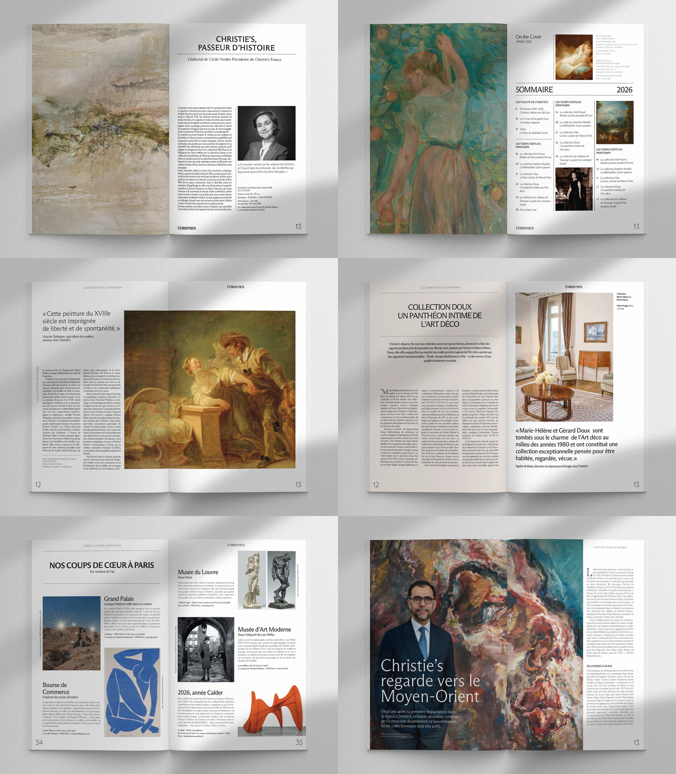
The previous template had accumulated too many competing elements across each spread, resulting in layouts that felt visually busy and lacked a clear hierarchy. The grid was inconsistent from spread to spread, making the overall publication feel less cohesive. Skim through a past issue here.
The goal was to create a more contemporary editorial system—one that introduced stronger hierarchy, greater consistency, more intentional use of whitespace, and Christie’s updated secondary typefaces and color palette, while retaining the character and sophistication expected of a Christie’s publication.
Reimagining the Editorial System
The project began with a broader look at how the existing Enchère identity could evolve without losing its connection to Christie’s. Under Arsh Raziuddin’s creative direction, we explored ways to simplify the visual language and establish a stronger editorial rhythm.
Arsh created the initial sample spreads, testing a refreshed approach to typography, imagery, color, spacing, and grid structure. These exploratory spreads became the foundation for the new template and gave stakeholders a tangible direction to review and refine.
Once the direction was approved, I took ownership of adapting the system into the Fall edition—translating the approved visual language across the full publication while responding to the evolving requirements of the Paris team.

From Busy to Intentional
One of the clearest opportunities was the contrast between the old and new systems.
The previous template often placed multiple visual elements in competition with one another. Headlines, body copy, imagery, captions, and decorative elements lacked a consistent relationship, making some spreads feel crowded and difficult to navigate.
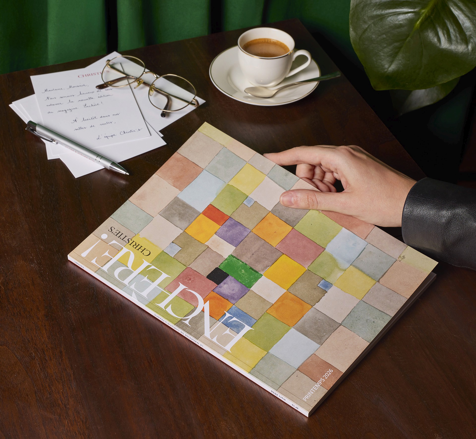
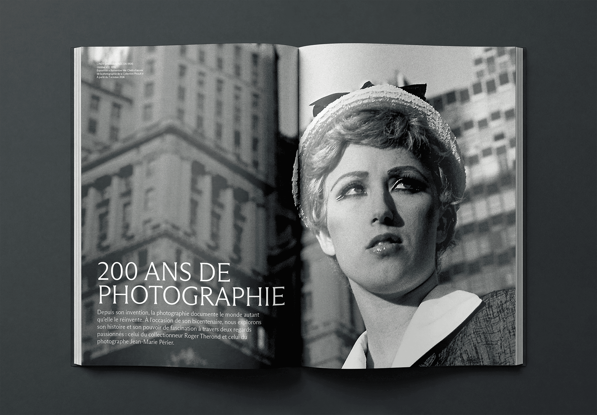
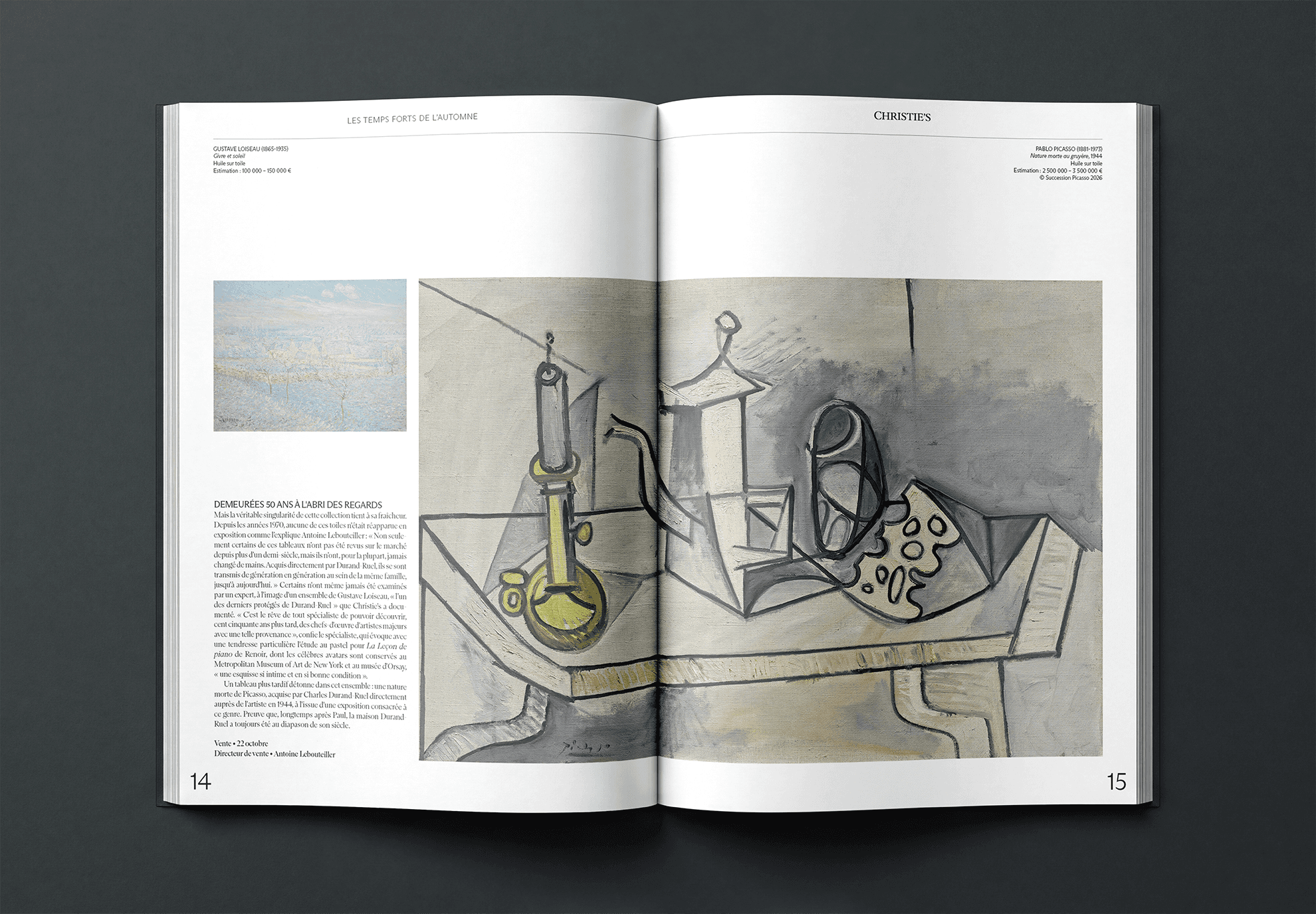
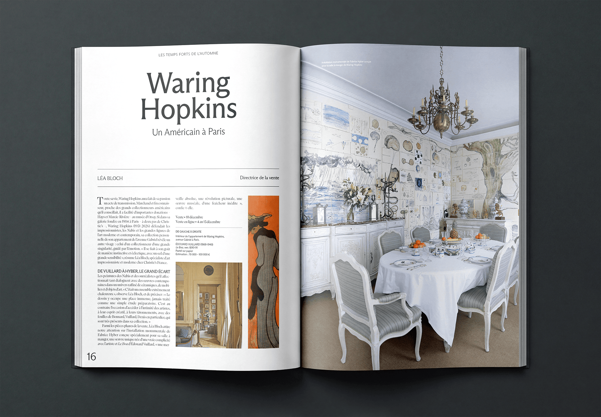
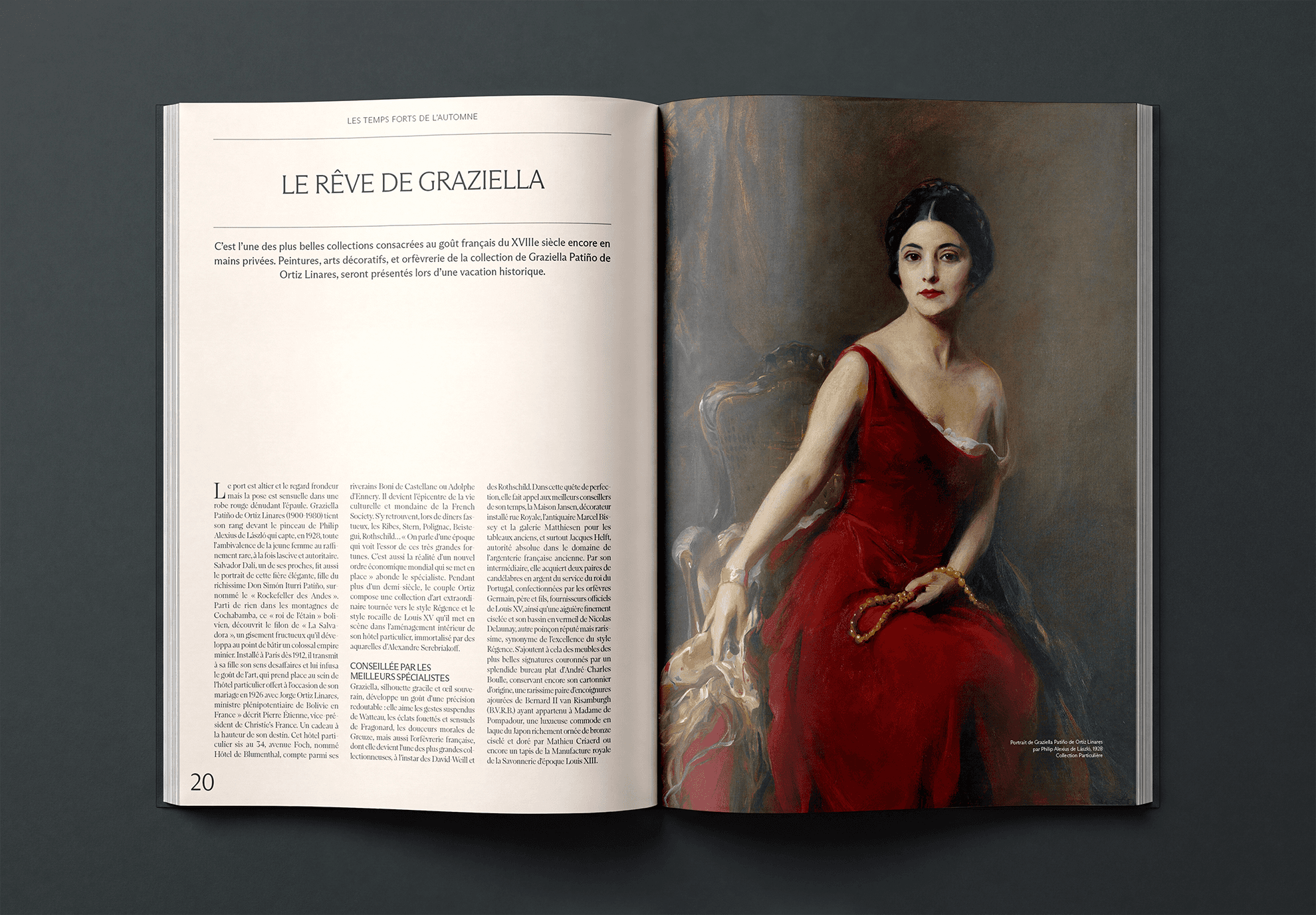
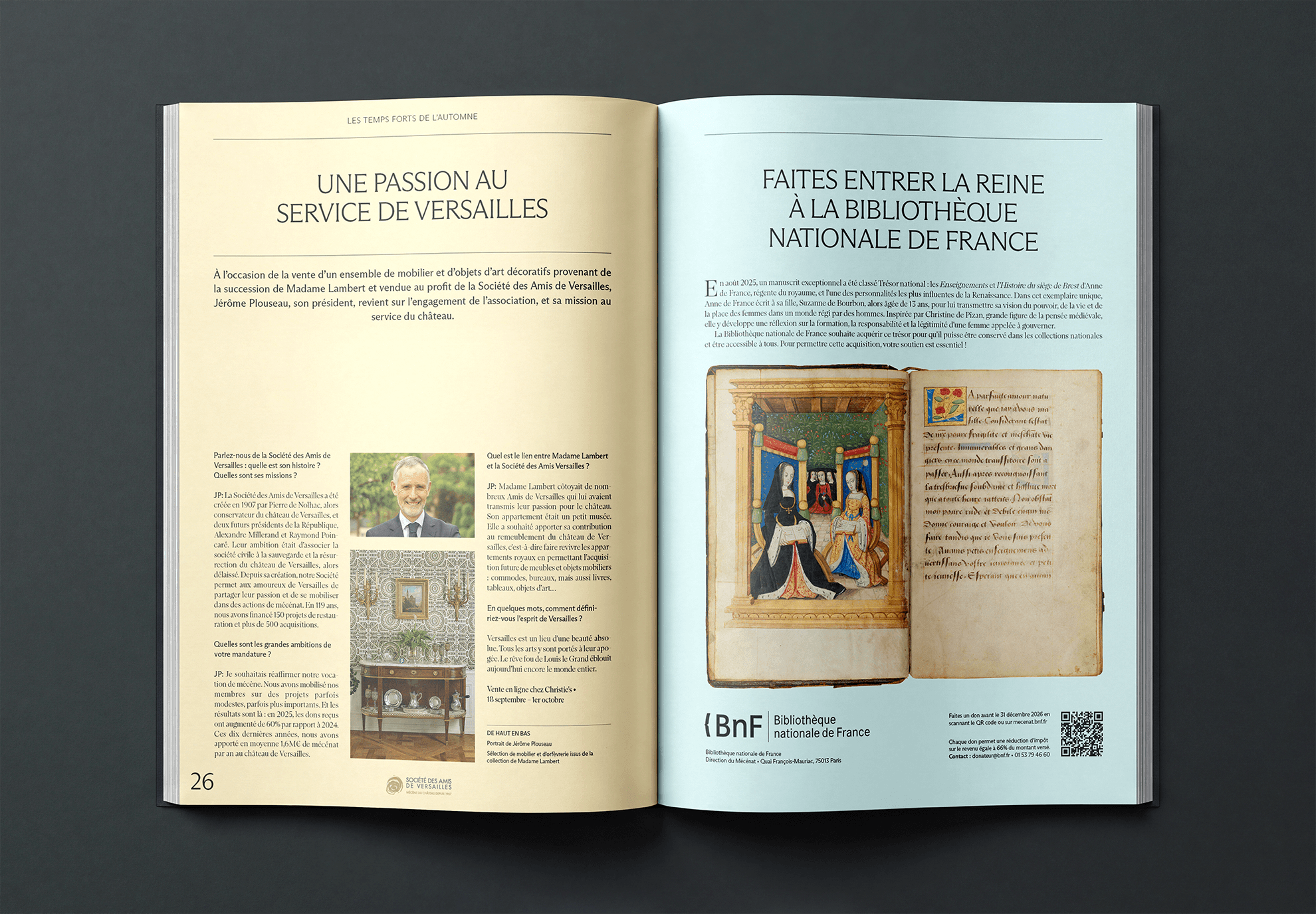
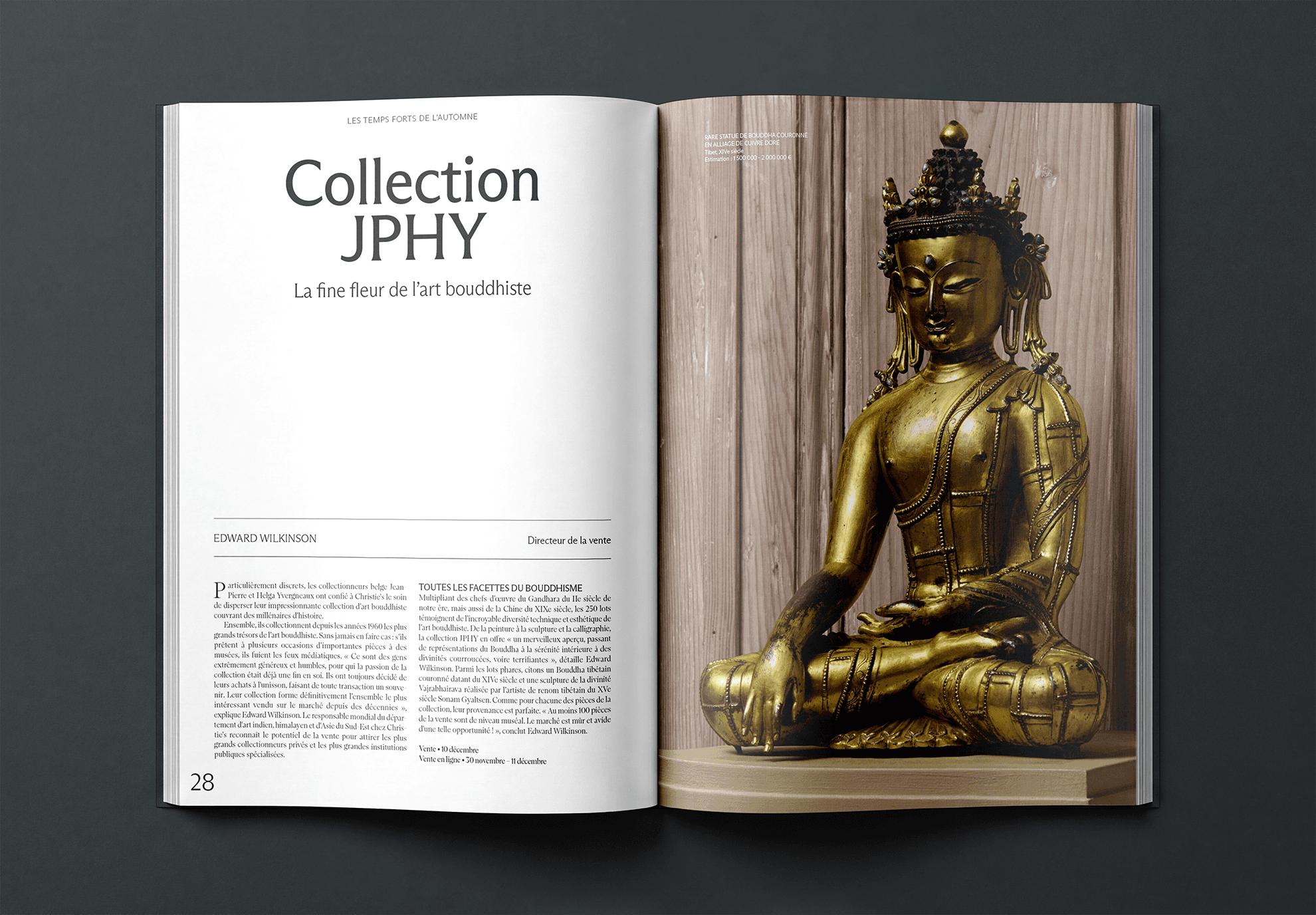
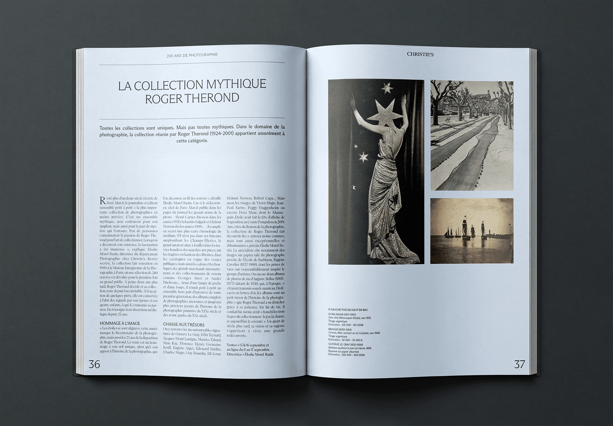
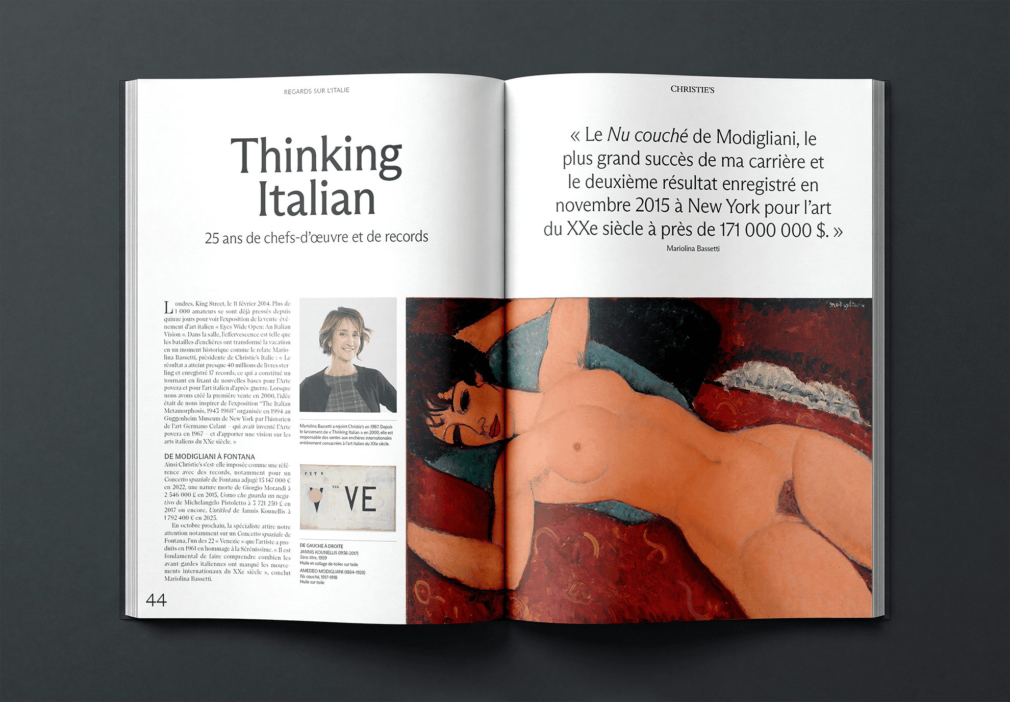
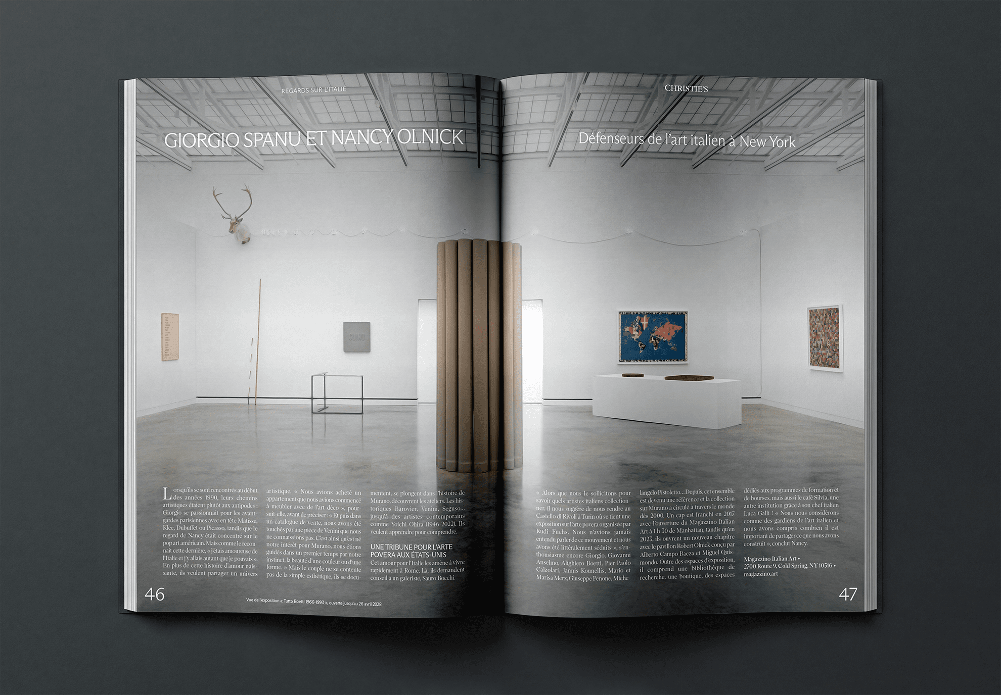
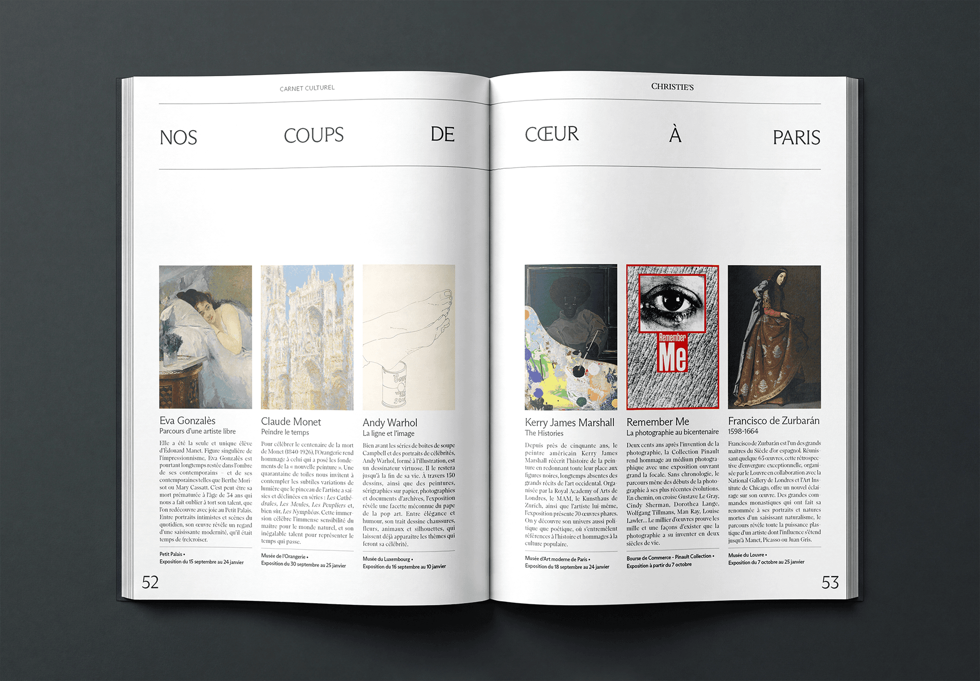
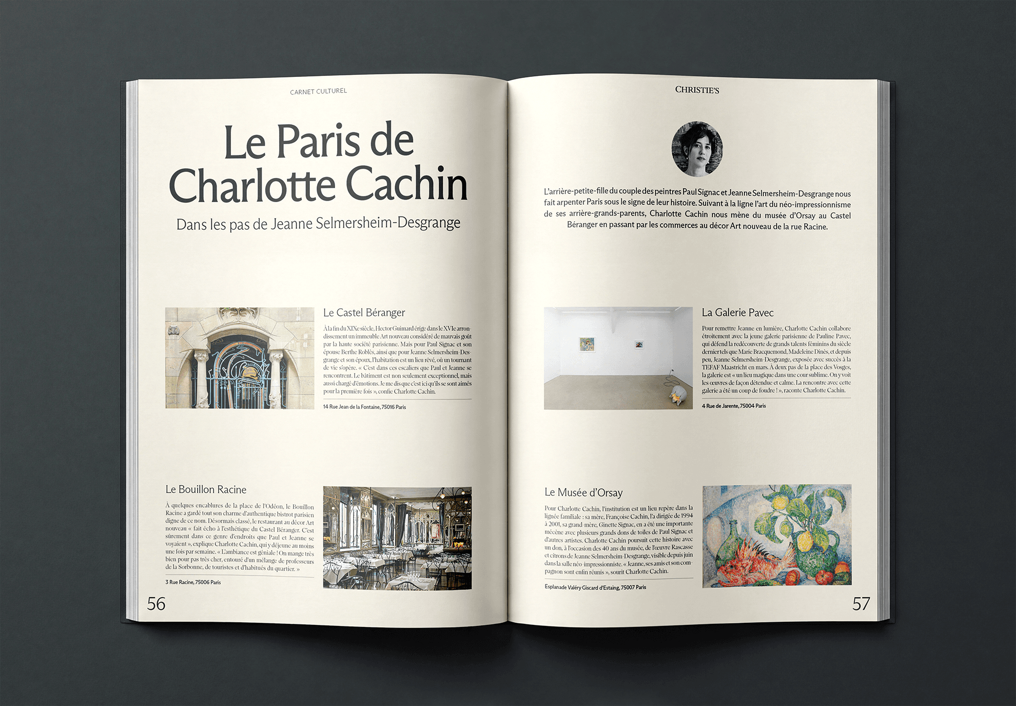
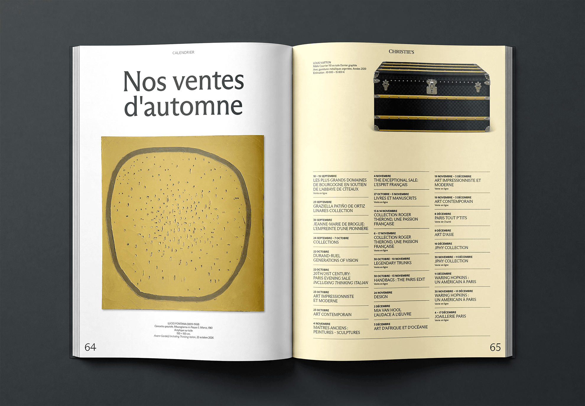
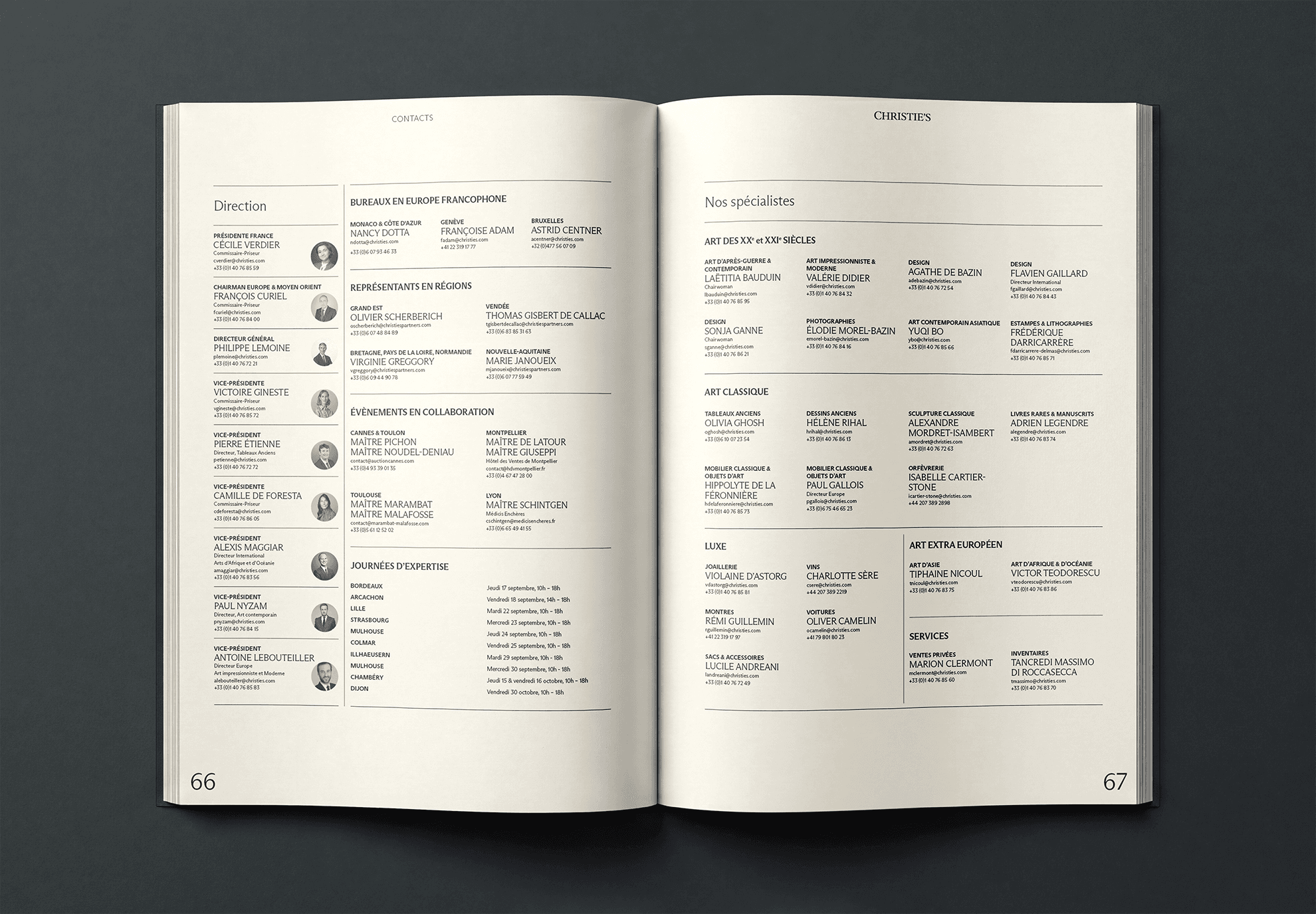
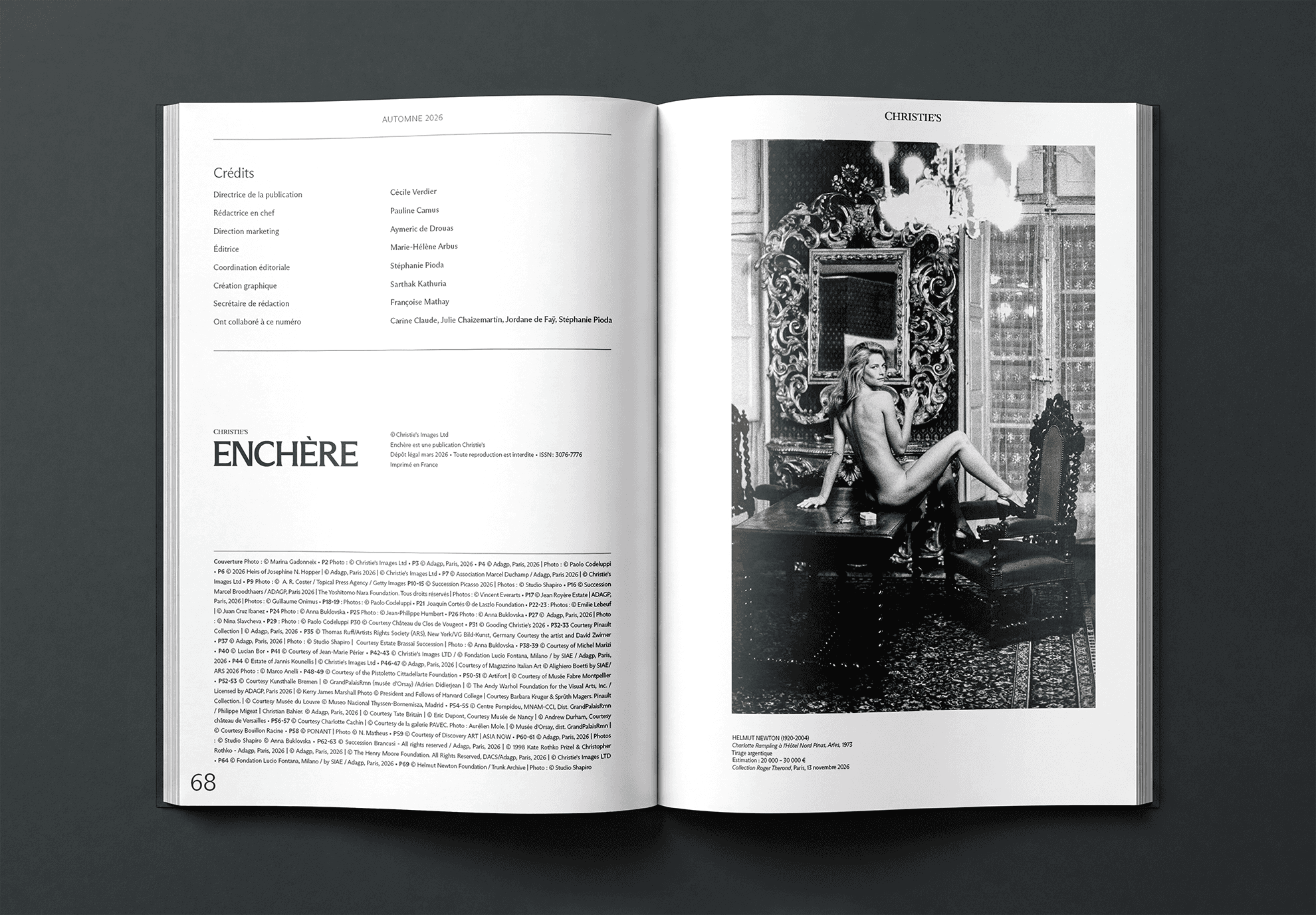
The refreshed system introduced a clearer modular grid and more deliberate hierarchy. Typography became a stronger organizational tool, imagery was given more room to breathe, and supporting information was treated with greater consistency.
The result was not simply a visual refresh—it was a more flexible editorial framework that could accommodate different types of content while still feeling unmistakably part of the same publication.

Translating the System into the Fall '26 Edition
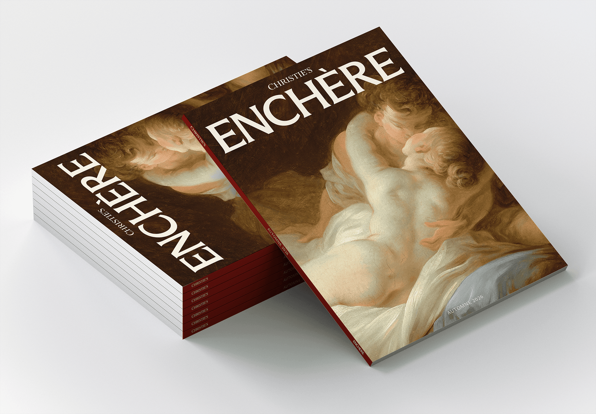
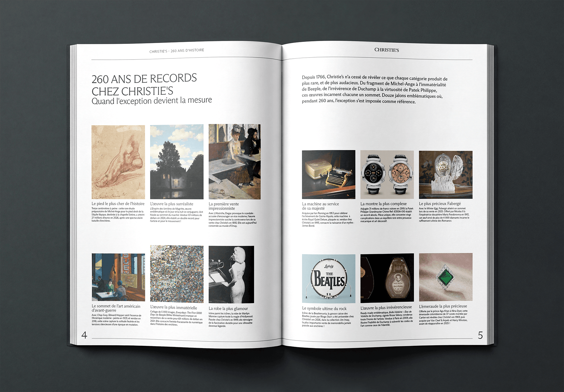
With the new template established, I adapted the system across the full Fall edition of Enchère.
Working closely with Pauline Camus and the Paris team, I navigated an evolving content pipeline where imagery, copy, page requirements, and stakeholder feedback continued to change throughout the three-month process. Because the publication was entirely in French—a language I do not speak—accuracy, attention to detail, and disciplined production workflows became especially important.
I worked carefully to bring over and format the French content while maintaining typographic hierarchy, spacing, image relationships, and consistency across the publication. The project required me to balance creative judgment with meticulous execution, often making quick design decisions as requirements shifted.
The final result was a contemporary editorial experience that feels more spacious, cohesive, and intentional—bringing the Enchère magazine closer to Christie’s current global creative direction while giving the Paris team a flexible foundation for future editions.



Final Thoughts
The refreshed Enchère template was met with strong enthusiasm across the global team. Pauline Camus was particularly impressed with how the new system translated into the Fall edition, while Aymeric, Marketing Director for Paris, was excited to see the refreshed direction come to life. John Jannuzzi also championed the work and saw the new template as an important step toward a fresher, more modern, elevated, and sophisticated editorial direction for Christie’s.
For me, the project demonstrated the value of thoughtful systems thinking in editorial design. Rather than simply making the magazine look newer, I helped translate an approved creative direction into a flexible, repeatable design system that could respond to real-world content, stakeholder needs, and production constraints. Seeing that system resonate with both the Paris team and global leadership reinforced how strong design can create alignment across teams while elevating the way a brand communicates.
Enchère is the quarterly magazine produced for Christie's Paris. The goal of this project was to refresh the established editorial template to better reflect Christie’s evolving creative direction.
The previous template had accumulated too many competing elements across each spread, resulting in layouts that felt visually busy and lacked a clear hierarchy. The grid was inconsistent from spread to spread, making the overall publication feel less cohesive. Skim through a past issue here.
The goal was to create a more contemporary editorial system—one that introduced stronger hierarchy, greater consistency, more intentional use of whitespace, and Christie’s updated secondary typefaces and color palette, while retaining the character and sophistication expected of a Christie’s publication.
Reimagining the Editorial System
The project began with a broader look at how the existing Enchère identity could evolve without losing its connection to Christie’s. Under Arsh Raziuddin’s creative direction, we explored ways to simplify the visual language and establish a stronger editorial rhythm.
Arsh created the initial sample spreads, testing a refreshed approach to typography, imagery, color, spacing, and grid structure. These exploratory spreads became the foundation for the new template and gave stakeholders a tangible direction to review and refine.
Once the direction was approved, I took ownership of adapting the system into the Fall edition—translating the approved visual language across the full publication while responding to the evolving requirements of the Paris team.
From Busy to Intentional
One of the clearest opportunities was the contrast between the old and new systems.
The previous template often placed multiple visual elements in competition with one another. Headlines, body copy, imagery, captions, and decorative elements lacked a consistent relationship, making some spreads feel crowded and difficult to navigate.
The refreshed system introduced a clearer modular grid and more deliberate hierarchy. Typography became a stronger organizational tool, imagery was given more room to breathe, and supporting information was treated with greater consistency.
The result was not simply a visual refresh—it was a more flexible editorial framework that could accommodate different types of content while still feeling unmistakably part of the same publication.
Translating the System into the Fall '26 Edition
With the new template established, I adapted the system across the full Fall edition of Enchère.
Working closely with Pauline Camus and the Paris team, I navigated an evolving content pipeline where imagery, copy, page requirements, and stakeholder feedback continued to change throughout the three-month process. Because the publication was entirely in French—a language I do not speak—accuracy, attention to detail, and disciplined production workflows became especially important.
I worked carefully to bring over and format the French content while maintaining typographic hierarchy, spacing, image relationships, and consistency across the publication. The project required me to balance creative judgment with meticulous execution, often making quick design decisions as requirements shifted.
The final result was a contemporary editorial experience that feels more spacious, cohesive, and intentional—bringing the Enchère magazine closer to Christie’s current global creative direction while giving the Paris team a flexible foundation for future editions.
Final Thoughts
The refreshed Enchère template was met with strong enthusiasm across the global team. Pauline Camus was particularly impressed with how the new system translated into the Fall edition, while Aymeric, Marketing Director for Paris, was excited to see the refreshed direction come to life. John Jannuzzi also championed the work and saw the new template as an important step toward a fresher, more modern, elevated, and sophisticated editorial direction for Christie’s.
For me, the project demonstrated the value of thoughtful systems thinking in editorial design. Rather than simply making the magazine look newer, I helped translate an approved creative direction into a flexible, repeatable design system that could respond to real-world content, stakeholder needs, and production constraints. Seeing that system resonate with both the Paris team and global leadership reinforced how strong design can create alignment across teams while elevating the way a brand communicates.
Enchère is the quarterly magazine produced for Christie's Paris. The goal of this project was to refresh the established editorial template to better reflect Christie’s evolving creative direction.
The previous template had accumulated too many competing elements across each spread, resulting in layouts that felt visually busy and lacked a clear hierarchy. The grid was inconsistent from spread to spread, making the overall publication feel less cohesive. Skim through a past issue here.
The goal was to create a more contemporary editorial system—one that introduced stronger hierarchy, greater consistency, more intentional use of whitespace, and Christie’s updated secondary typefaces and color palette, while retaining the character and sophistication expected of a Christie’s publication.
Reimagining the Editorial System
The project began with a broader look at how the existing Enchère identity could evolve without losing its connection to Christie’s. Under Arsh Raziuddin’s creative direction, we explored ways to simplify the visual language and establish a stronger editorial rhythm.
Arsh created the initial sample spreads, testing a refreshed approach to typography, imagery, color, spacing, and grid structure. These exploratory spreads became the foundation for the new template and gave stakeholders a tangible direction to review and refine.
Once the direction was approved, I took ownership of adapting the system into the Fall edition—translating the approved visual language across the full publication while responding to the evolving requirements of the Paris team.
From Busy to Intentional
One of the clearest opportunities was the contrast between the old and new systems.
The previous template often placed multiple visual elements in competition with one another. Headlines, body copy, imagery, captions, and decorative elements lacked a consistent relationship, making some spreads feel crowded and difficult to navigate.
The refreshed system introduced a clearer modular grid and more deliberate hierarchy. Typography became a stronger organizational tool, imagery was given more room to breathe, and supporting information was treated with greater consistency.
The result was not simply a visual refresh—it was a more flexible editorial framework that could accommodate different types of content while still feeling unmistakably part of the same publication.
Translating the System into the Fall '26 Edition
With the new template established, I adapted the system across the full Fall edition of Enchère.
Working closely with Pauline Camus and the Paris team, I navigated an evolving content pipeline where imagery, copy, page requirements, and stakeholder feedback continued to change throughout the three-month process. Because the publication was entirely in French—a language I do not speak—accuracy, attention to detail, and disciplined production workflows became especially important.
I worked carefully to bring over and format the French content while maintaining typographic hierarchy, spacing, image relationships, and consistency across the publication. The project required me to balance creative judgment with meticulous execution, often making quick design decisions as requirements shifted.
The final result was a contemporary editorial experience that feels more spacious, cohesive, and intentional—bringing the Enchère magazine closer to Christie’s current global creative direction while giving the Paris team a flexible foundation for future editions.
Final Thoughts
The refreshed Enchère template was met with strong enthusiasm across the global team. Pauline Camus was particularly impressed with how the new system translated into the Fall edition, while Aymeric, Marketing Director for Paris, was excited to see the refreshed direction come to life. John Jannuzzi also championed the work and saw the new template as an important step toward a fresher, more modern, elevated, and sophisticated editorial direction for Christie’s.
For me, the project demonstrated the value of thoughtful systems thinking in editorial design. Rather than simply making the magazine look newer, I helped translate an approved creative direction into a flexible, repeatable design system that could respond to real-world content, stakeholder needs, and production constraints. Seeing that system resonate with both the Paris team and global leadership reinforced how strong design can create alignment across teams while elevating the way a brand communicates.

Explore More Projects
Johnny Johnny
Branding · Art Direction · Print · Packaging
Full Card Sweep
Branding · Digital Marketing · UI · Front-End Dev
NY Cocktail Co.
Branding · Digital Marketing · UI · Front-End Dev
Phigora
Branding · Experiential · Digital Marketing · UI
Typomania
Branding · Motion

Spellbound Wines
Branding · Motion · Digital Marketing · Experiential
Explore More Projects
Johnny Johnny
Branding · Art Direction · Print · Packaging
Full Card Sweep
Branding · Digital Marketing · UI · Front-End Dev
NY Cocktail Co.
Branding · Digital Marketing · UI · Front-End Dev
Phigora
Branding · Experiential · Digital Marketing · UI
Typomania
Branding · Motion
Spellbound Wines
Branding · Motion · Digital Marketing · Experiential
Explore More Projects
Johnny Johnny
Branding · Art Direction · Print · Packaging
Full Card Sweep
Branding · Digital Marketing · UI · Front-End Dev
NY Cocktail Co.
Branding · Digital Marketing · UI · Front-End Dev
Phigora
Branding · Experiential · Digital Marketing · UI
Typomania
Branding · Motion
Spellbound Wines
Branding · Motion · Digital Marketing · Experiential