Museum Without Borders
Museum Without Borders
Branding · Motion · Digital Marketing · Experiential · Print

A Borderless Identity for a Bold & Dynamic Museum
A Borderless Identity for a Bold & Dynamic Museum
Project Timeline
Project Timeline
01/2025 - Present
My Role
My Role
Creative Director
Visual Designer
UX Designer
UI Designer
Interaction Designer
Front-End Designer
Deliverables
Deliverables
Brand Identity
Design System
Poster Design
Environmental Design
Social Media Templates
Marketing Collateral
UX Design
Responsive Website
Museum without Borders is a visionary public art museum in New York dedicated to celebrating, preserving, and amplifying the voices of immigrant artists. It serves as a sanctuary for artistic expression, showcasing the profound cultural contributions of artists who have made the United States their home. Through exhibitions, events, and digital storytelling, the museum fosters a deeper appreciation for the immigrant experience, bridging diverse communities through the universal language of art.
The museum is both a physical and digital space, ensuring accessibility to global audiences. Its interactive website and mobile app provide exhibition details, artist spotlights, museum information, and visit scheduling, making it an inclusive platform for art enthusiasts, educators, and the general public.

Creating the Brand
Branding a museum that celebrates the vibrancy, diversity, and resilience of immigrant artists required a visual language that was just as bold, dynamic, and inclusive as its mission. As the lead designer, I built this identity from the ground up, ensuring every element—typography, color, motion, and spatial design—aligned with the museum’s ethos.

Defining the Visual Identity: Aesthetic & Conceptual Direction
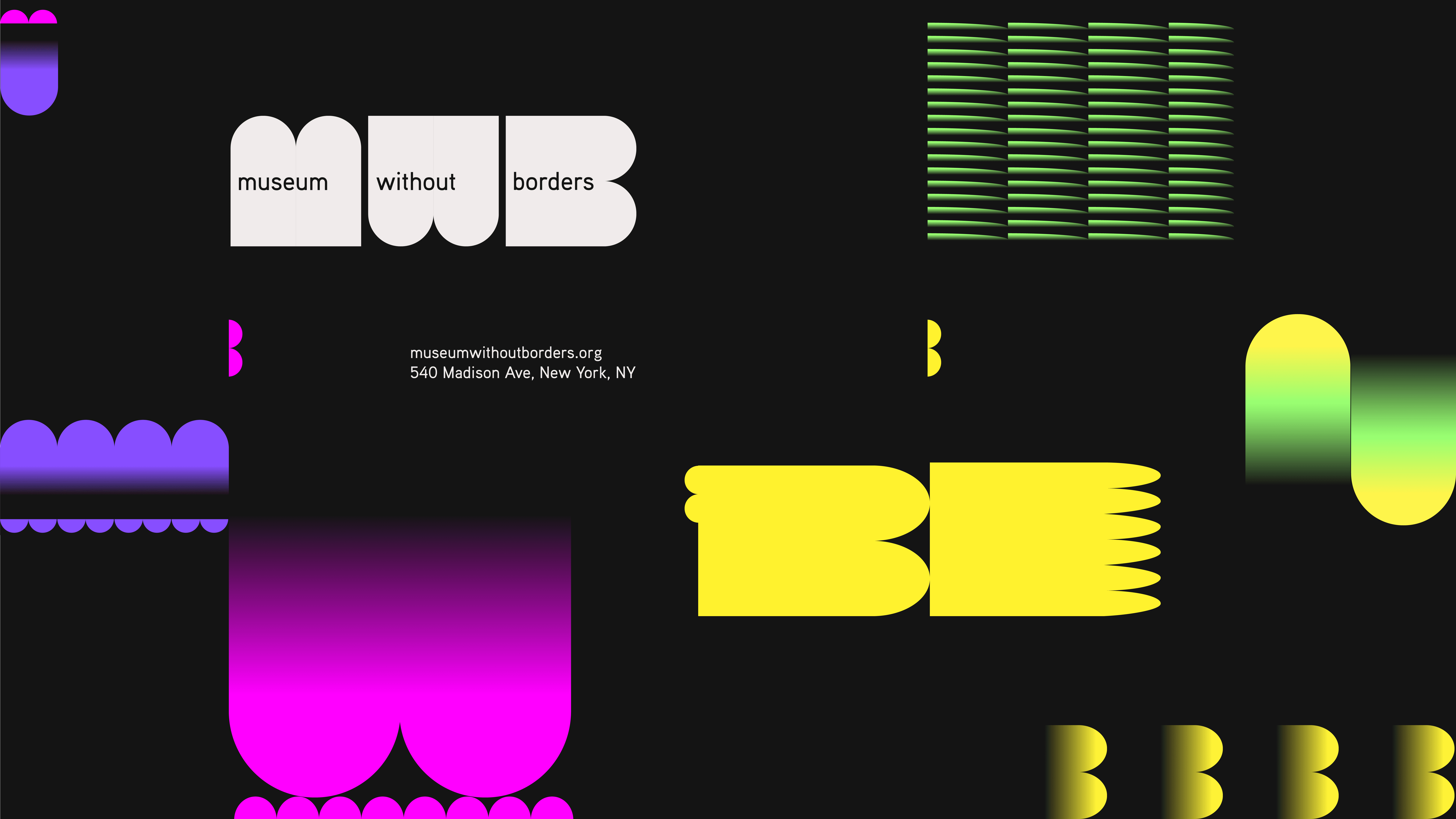
I started by grounding the branding in the museum’s philosophy: celebrating difference, uniqueness, and the richness of cultural exchange. The identity had to be bold, adaptable, and welcoming, reflecting the museum as both a physical and digital space that bridges diverse communities. I leaned into high-contrast neon colors, dynamic modular grids, and kinetic motion design to create a system that could evolve and respond across different applications.
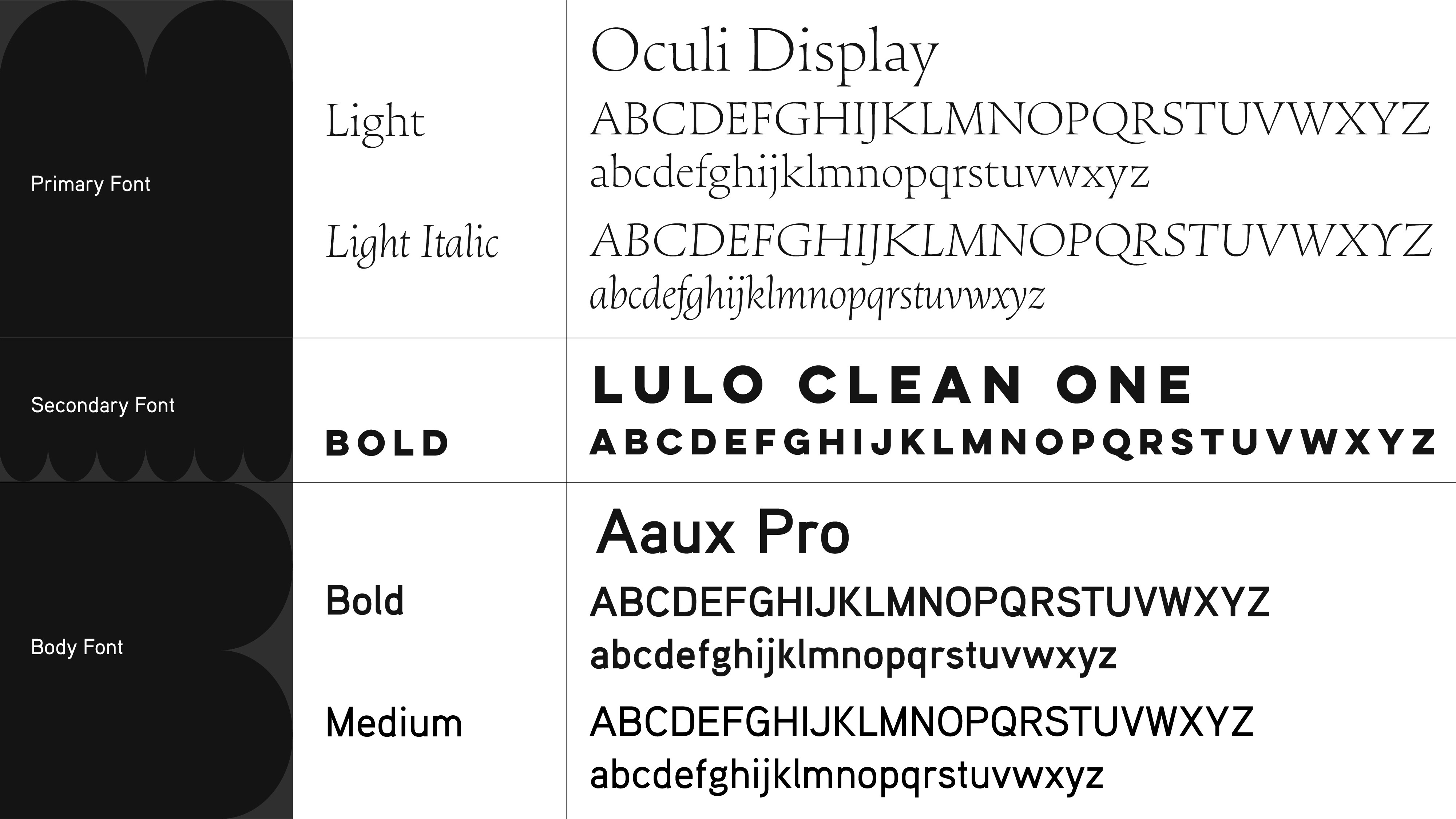
Typography: Bold, Expressive, and Modular
Typography was a key pillar of this identity. I selected typefaces that balanced bold impact with expressive fluidity, mirroring how immigrant artists shape and reshape cultural landscapes. The modular grid system allowed typography to take center stage in various applications, offering a sense of movement and adaptability—essential qualities for a borderless, ever-evolving space.
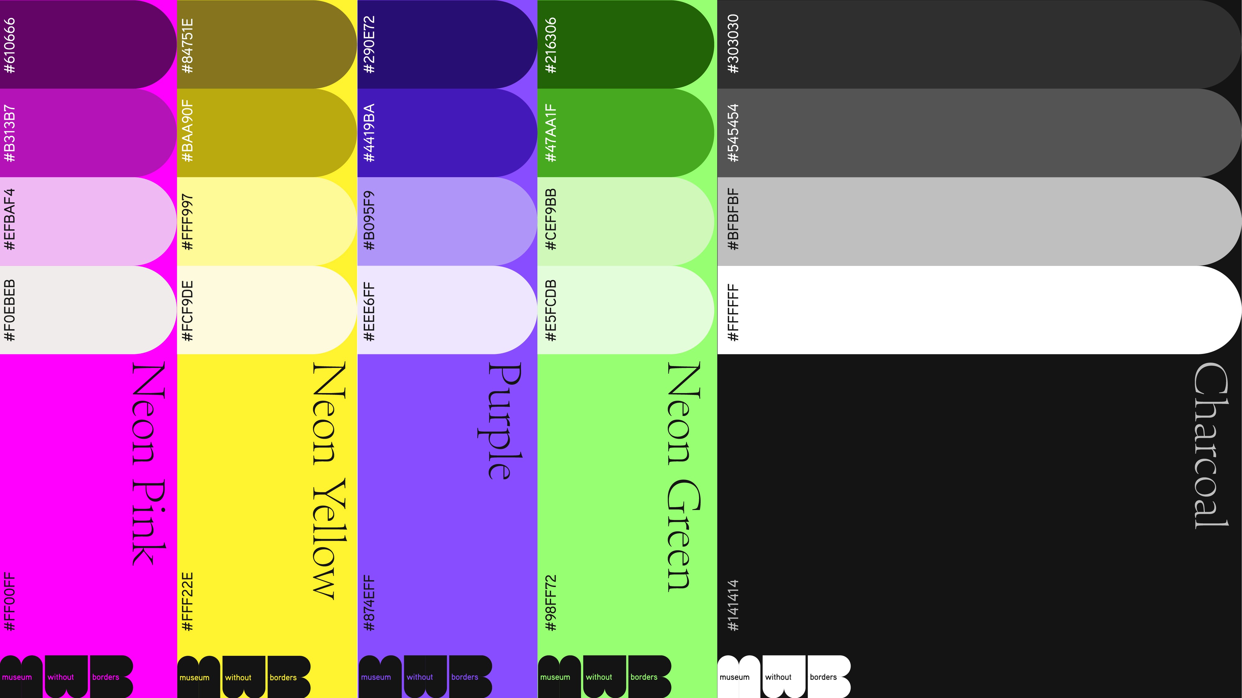
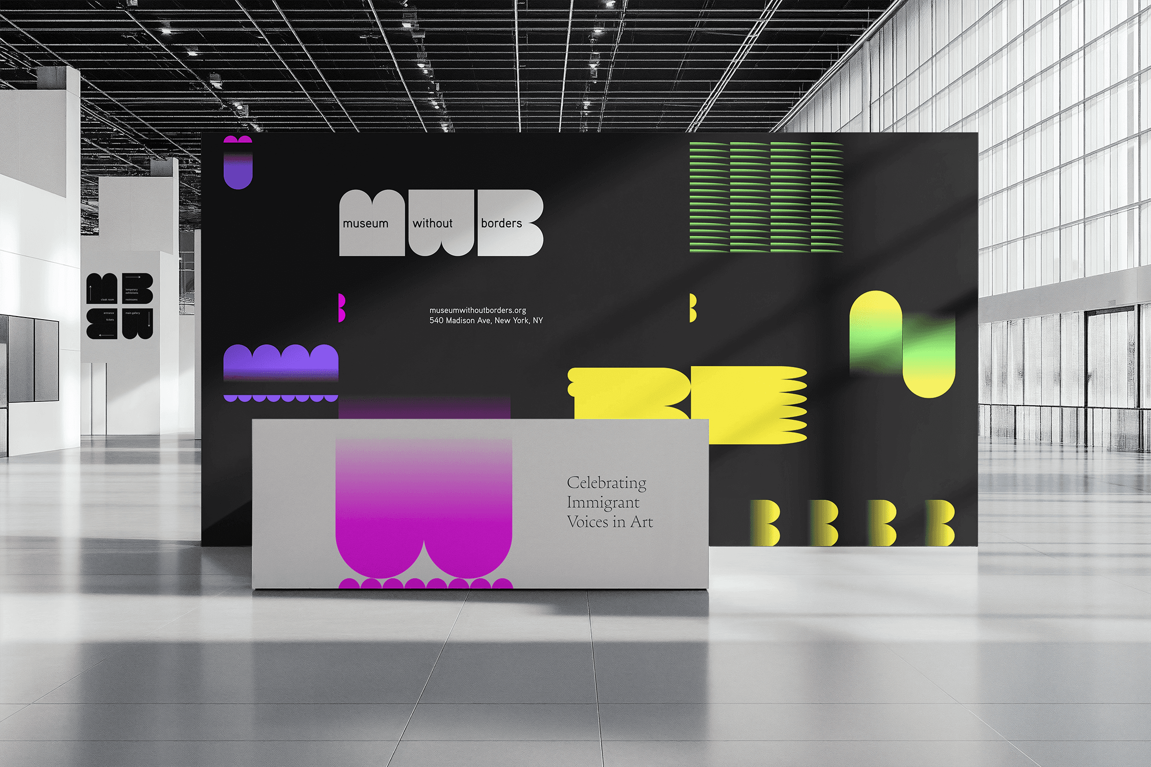
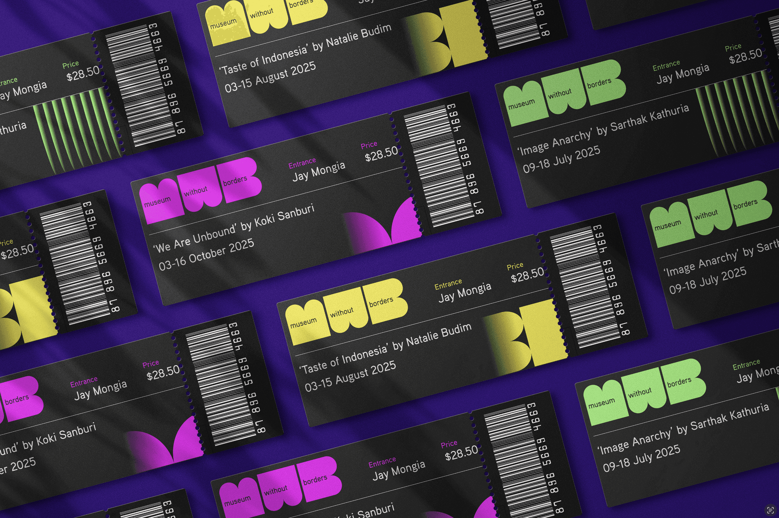
Color Palette: A Neon Celebration of Diversity
Color was instrumental in reinforcing the museum’s dynamic spirit. I developed a high-contrast, neon-inspired palette that feels electric and celebratory, symbolizing the vibrant contributions of immigrant artists. The colors work modularly, shifting and adapting to different media, whether in print, digital, or environmental applications.

Motion Design: Bringing the Brand to Life
The brand needed to move—it couldn’t be static. I designed kinetic logo animations and motion principles that reflect the fluidity and energy of the immigrant experience. These animations ensure that the brand stays alive across digital platforms, from website interactions to social media content.
Layouts & Applications: Posters, Social Media & Branded Collateral
Using a flexible modular system, I crafted posters, social media templates, branded tickets, and wristbands that all work cohesively within the identity. The grid structure allows for seamless adaptability, just like the museum itself, which welcomes diverse artistic expressions.


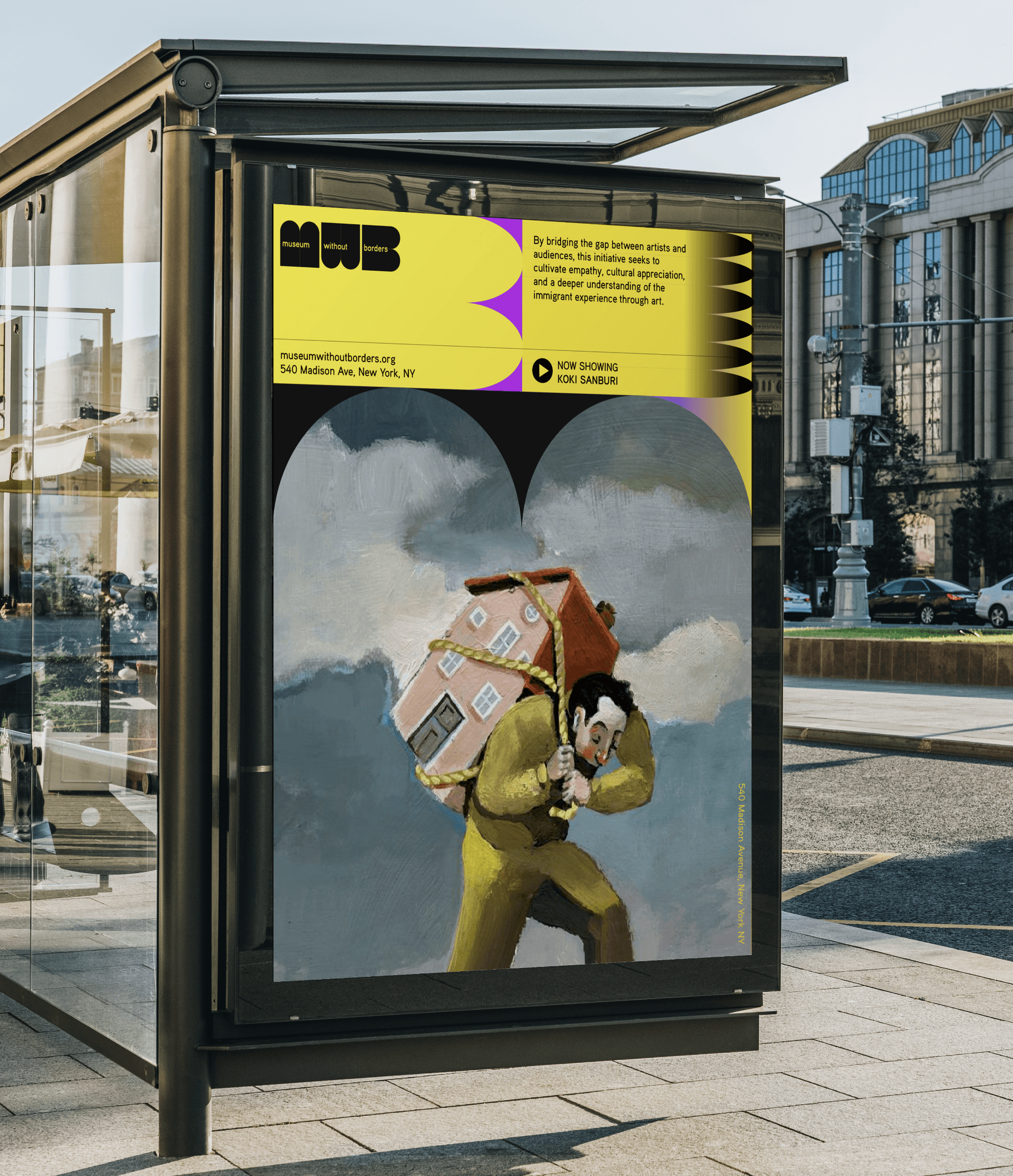
Environmental Design: Bringing the Museum to Life
Finally, I extended the branding into the physical space, ensuring that the museum’s identity translated into immersive experiences. From large-scale signage to interactive installations, the brand interacts with visitors in a way that is both engaging and memorable.


Final Thoughts: A Brand Without Borders
This project was an exciting challenge in designing a brand that is not just seen but felt—one that celebrates the power of storytelling, resilience, and artistic expression.
I’m currently seeking my next full-time role where I can bring this level of strategic, thoughtful, and dynamic design expertise to a team that values impactful, culture-driven branding. Let’s connect!

Museum without Borders is a visionary public art museum in New York dedicated to celebrating, preserving, and amplifying the voices of immigrant artists. It serves as a sanctuary for artistic expression, showcasing the profound cultural contributions of artists who have made the United States their home. Through exhibitions, events, and digital storytelling, the museum fosters a deeper appreciation for the immigrant experience, bridging diverse communities through the universal language of art.
The museum is both a physical and digital space, ensuring accessibility to global audiences. Its interactive website and mobile app provide exhibition details, artist spotlights, museum information, and visit scheduling, making it an inclusive platform for art enthusiasts, educators, and the general public.
Creating the Brand
Branding a museum that celebrates the vibrancy, diversity, and resilience of immigrant artists required a visual language that was just as bold, dynamic, and inclusive as its mission. As the lead designer, I built this identity from the ground up, ensuring every element—typography, color, motion, and spatial design—aligned with the museum’s ethos.
Defining the Visual Identity: Aesthetic & Conceptual Direction
I started by grounding the branding in the museum’s philosophy: celebrating difference, uniqueness, and the richness of cultural exchange. The identity had to be bold, adaptable, and welcoming, reflecting the museum as both a physical and digital space that bridges diverse communities. I leaned into high-contrast neon colors, dynamic modular grids, and kinetic motion design to create a system that could evolve and respond across different applications.
Typography: Bold, Expressive, and Modular
Typography was a key pillar of this identity. I selected typefaces that balanced bold impact with expressive fluidity, mirroring how immigrant artists shape and reshape cultural landscapes. The modular grid system allowed typography to take center stage in various applications, offering a sense of movement and adaptability—essential qualities for a borderless, ever-evolving space.
Color Palette: A Neon Celebration of Diversity
Color was instrumental in reinforcing the museum’s dynamic spirit. I developed a high-contrast, neon-inspired palette that feels electric and celebratory, symbolizing the vibrant contributions of immigrant artists. The colors work modularly, shifting and adapting to different media, whether in print, digital, or environmental applications.
Motion Design: Bringing the Brand to Life
The brand needed to move—it couldn’t be static. I designed kinetic logo animations and motion principles that reflect the fluidity and energy of the immigrant experience. These animations ensure that the brand stays alive across digital platforms, from website interactions to social media content.
Layouts & Applications: Posters, Social Media & Branded Collateral
Using a flexible modular system, I crafted posters, social media templates, branded tickets, and wristbands that all work cohesively within the identity. The grid structure allows for seamless adaptability, just like the museum itself, which welcomes diverse artistic expressions.
Environmental Design: Bringing the Museum to Life
Finally, I extended the branding into the physical space, ensuring that the museum’s identity translated into immersive experiences. From large-scale signage to interactive installations, the brand interacts with visitors in a way that is both engaging and memorable.
Final Thoughts: A Brand Without Borders
This project was an exciting challenge in designing a brand that is not just seen but felt—one that celebrates the power of storytelling, resilience, and artistic expression.
I’m currently seeking my next full-time role where I can bring this level of strategic, thoughtful, and dynamic design expertise to a team that values impactful, culture-driven branding. Let’s connect!

Explore More Projects

Johnny Johnny
Branding · Art Direction · Print · Packaging


Full Card Sweep
Branding · Digital Marketing · UI · Front-End Dev
NY Cocktail Co.
Branding · Digital Marketing · UI · Front-End Dev


Phigora
Branding · Experiential · Digital Marketing · UI
Typomania
Branding · Motion

Spellbound Wines
Branding · Motion · Digital Marketing · Experiential
Explore More Projects
Johnny Johnny
Branding · Art Direction · Print · Packaging
Full Card Sweep
Branding · Digital Marketing · UI · Front-End Dev
NY Cocktail Co.
Branding · Digital Marketing · UI · Front-End Dev
Phigora
Branding · Experiential · Digital Marketing · UI
Typomania
Branding · Motion
Spellbound Wines
Branding · Motion · Digital Marketing · Experiential