Be Cannabis
Be Cannabis
Branding · Motion · Digital Marketing · UI · Print
Be: The Cannabis Store—A Bold Identity for a New Era of Cannabis
Be: The Cannabis Store—A Bold Identity for a New Era of Cannabis
Project Timeline
Project Timeline
08/2024 - 11/2024
My Role
My Role
Freelance Brand Designer
Visual Designer
UI Designer
Deliverables
Deliverables
Brand Identity
Brand Guidelines
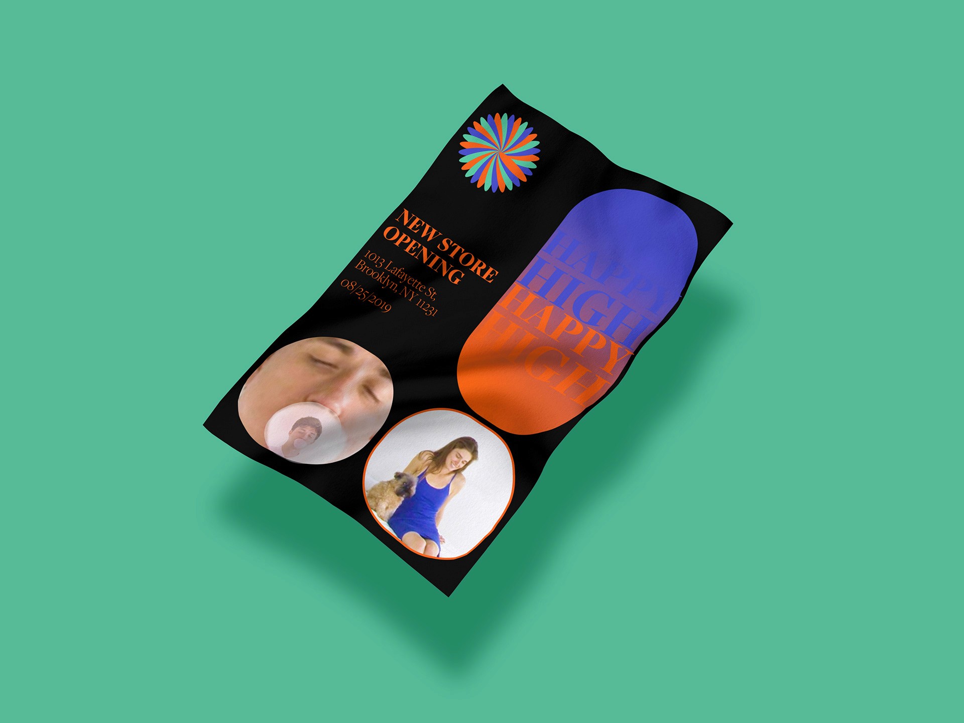
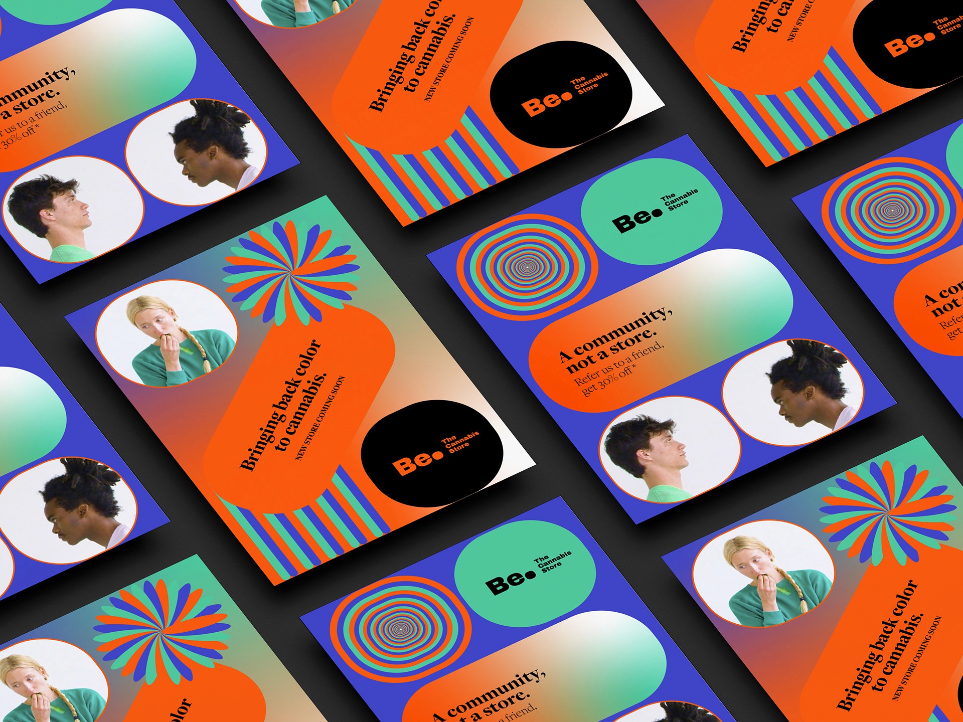
Poster Design
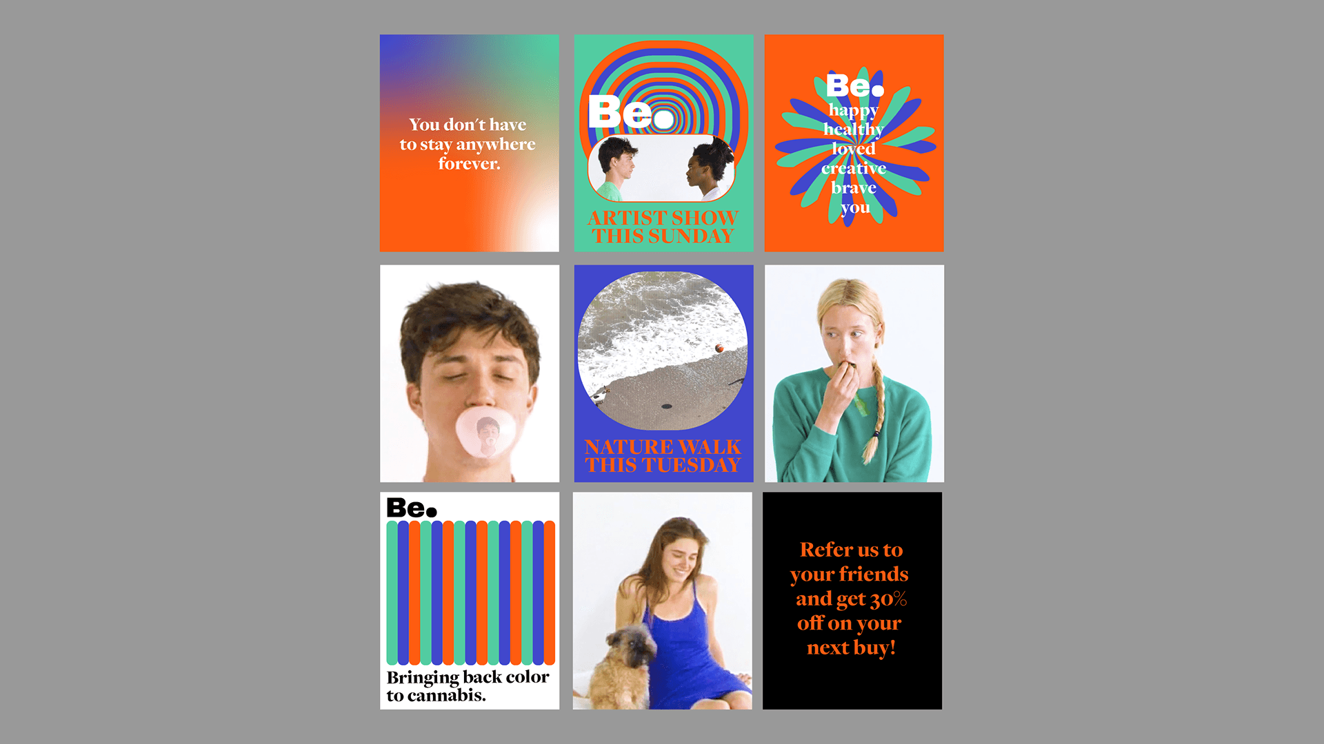
Social Media Templates
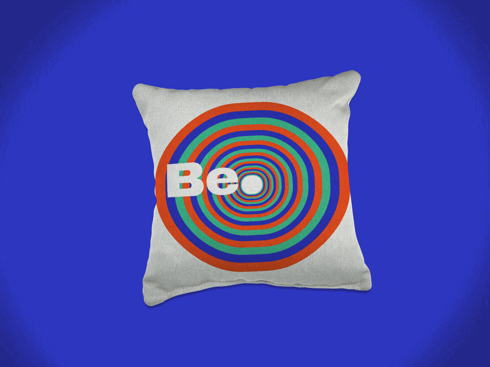
Merch/Swag Design
UI Prototypes
The Challenge
Be: The Cannabis Store sought to move beyond being just another dispensary. The goal was to create a bold, engaging, and millennial-friendly brand that redefined the cannabis retail experience—bridging education, lifestyle, and premium product offerings.
Starting with just a standalone logo, the challenge was to expand it into a fully developed brand ecosystem—from visual identity and digital presence to motion assets and physical touchpoints.
Brand Identity: Crafting a Distinct Visual Language
To set Be: apart in a saturated market, I developed a modern, vibrant, and sophisticated brand system, carefully balancing playfulness and credibility.
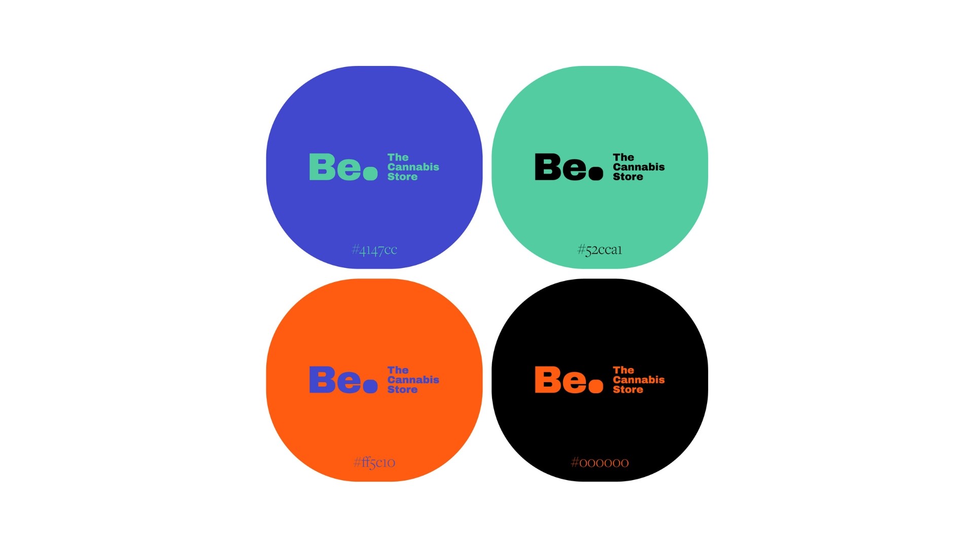
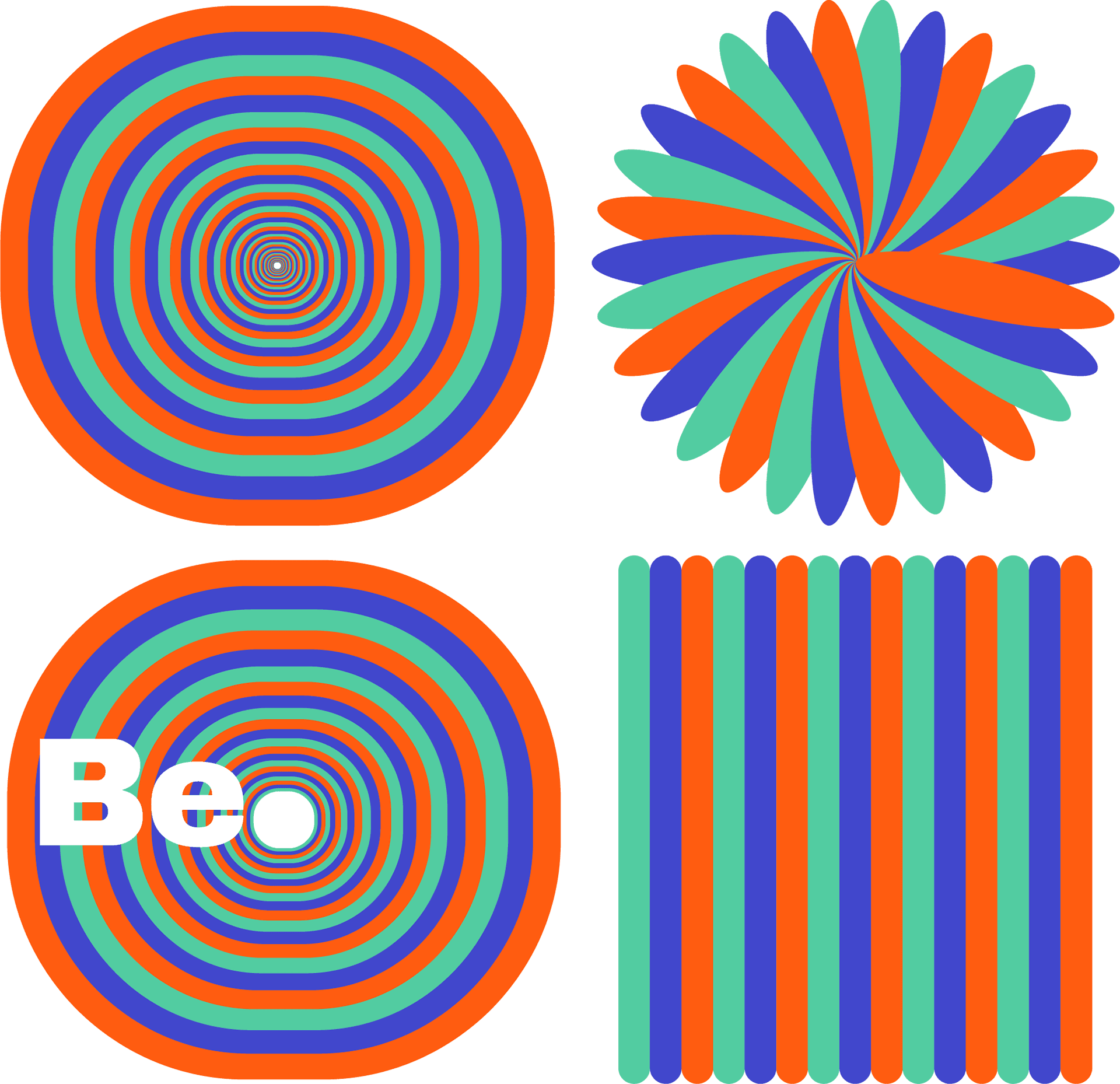
Brand Guidelines: Established a structured yet flexible system, defining typography, color palettes, iconography, and layouts to maintain brand consistency across all platforms.
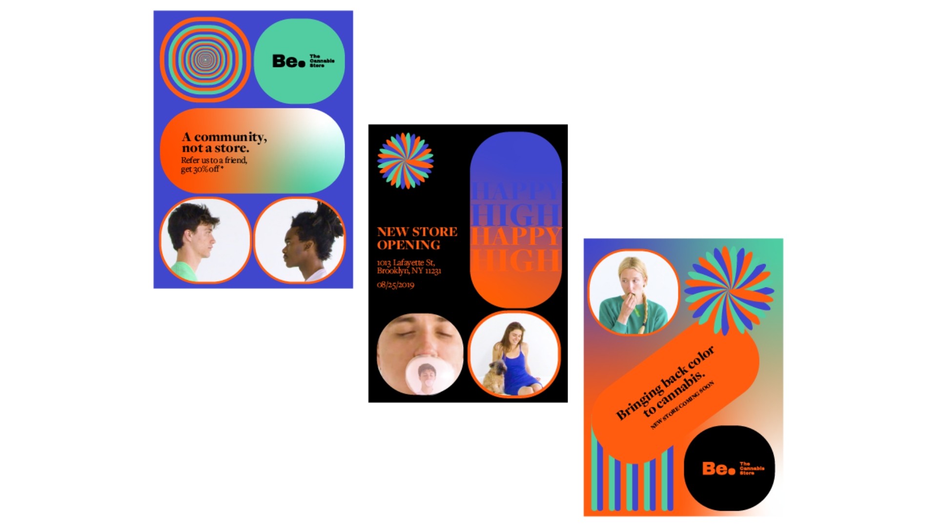
Poster Design: Designed a striking series of posters that merged bold typography with abstract cannabis-inspired graphics, creating high-impact visual storytelling.
Merch/Swag Concepts: Conceptualized apparel and accessories that turned customers into brand ambassadors, ensuring a lifestyle-driven presence.
Motion & Digital Marketing: Driving Awareness & Engagement
To amplify Be:’s presence, I developed dynamic motion assets and a targeted social media strategy.
Social Media Templates: Designed adaptable templates for Instagram and TikTok, focusing on education, community building, and product highlights—aligning Be: with millennial and Gen Z cannabis culture.
Motion Design: Created short-form animations and looping motion graphics to enhance engagement across social channels and digital ads.
Content Strategy: Implemented a cohesive digital marketing approach, ensuring brand storytelling was visually compelling, informative, and culturally relevant.
UI & Digital Presence: Enhancing the Customer Journey
The cannabis retail experience needed to extend beyond the store—so I designed UI prototypes for a seamless online experience.
Website Prototypes: Crafted a modular UI system for desktop & mobile, focused on product discovery, educational resources, and event announcements.
User-Centric Experience: Ensured a clean, engaging layout, making it easy for users to browse products, explore educational content, and stay connected with the Be: community.
The Impact
By transforming a single logo into a fully realized brand, Be: The Cannabis Store successfully established itself as a modern, premium cannabis retailer with a compelling brand voice, an engaging digital presence, and a design system built for longevity.
From print and merch to UI and social media, the brand now connects deeply with its millennial audience, setting the stage for long-term market success.
The Challenge
Be: The Cannabis Store sought to move beyond being just another dispensary. The goal was to create a bold, engaging, and millennial-friendly brand that redefined the cannabis retail experience—bridging education, lifestyle, and premium product offerings.
Starting with just a standalone logo, the challenge was to expand it into a fully developed brand ecosystem—from visual identity and digital presence to motion assets and physical touchpoints.
Brand Identity: Crafting a Distinct Visual Language
To set Be: apart in a saturated market, I developed a modern, vibrant, and sophisticated brand system, carefully balancing playfulness and credibility.
Brand Guidelines: Established a structured yet flexible system, defining typography, color palettes, iconography, and layouts to maintain brand consistency across all platforms.
Poster Design: Designed a striking series of posters that merged bold typography with abstract cannabis-inspired graphics, creating high-impact visual storytelling.
Merch/Swag Concepts: Conceptualized apparel and accessories that turned customers into brand ambassadors, ensuring a lifestyle-driven presence.
Motion & Digital Marketing: Driving Awareness & Engagement
To amplify Be:’s presence, I developed dynamic motion assets and a targeted social media strategy.
Social Media Templates: Designed adaptable templates for Instagram and TikTok, focusing on education, community building, and product highlights—aligning Be: with millennial and Gen Z cannabis culture.
Motion Design: Created short-form animations and looping motion graphics to enhance engagement across social channels and digital ads.
Content Strategy: Implemented a cohesive digital marketing approach, ensuring brand storytelling was visually compelling, informative, and culturally relevant.
UI & Digital Presence: Enhancing the Customer Journey
The cannabis retail experience needed to extend beyond the store—so I designed UI prototypes for a seamless online experience.
Website Prototypes: Crafted a modular UI system for desktop & mobile, focused on product discovery, educational resources, and event announcements.
User-Centric Experience: Ensured a clean, engaging layout, making it easy for users to browse products, explore educational content, and stay connected with the Be: community.
The Impact
By transforming a single logo into a fully realized brand, Be: The Cannabis Store successfully established itself as a modern, premium cannabis retailer with a compelling brand voice, an engaging digital presence, and a design system built for longevity.
From print and merch to UI and social media, the brand now connects deeply with its millennial audience, setting the stage for long-term market success.

Explore More Projects

Johnny Johnny
Branding · Art Direction · Print · Packaging

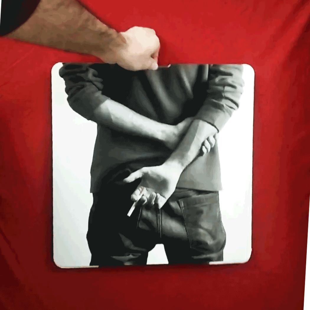
Full Card Sweep
Branding · Digital Marketing · UI · Front-End Dev
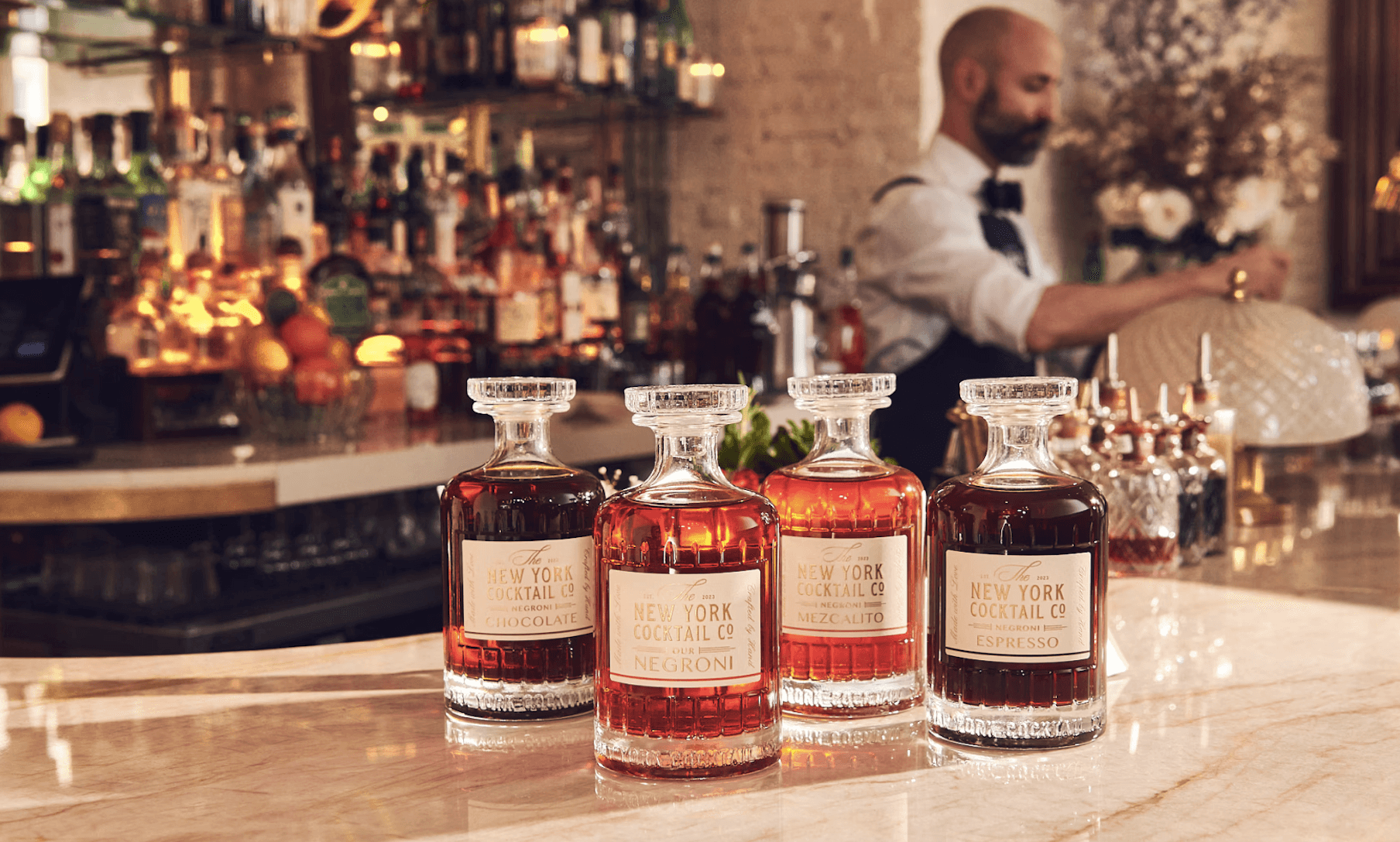
NY Cocktail Co.
Branding · Digital Marketing · UI · Front-End Dev


Phigora
Branding · Experiential · Digital Marketing · UI

Typomania
Branding · Motion


Spellbound Wines
Branding · Motion · Digital Marketing · Experiential
Explore More Projects
Johnny Johnny
Branding · Art Direction · Print · Packaging
Full Card Sweep
Branding · Digital Marketing · UI · Front-End Dev
NY Cocktail Co.
Branding · Digital Marketing · UI · Front-End Dev
Phigora
Branding · Experiential · Digital Marketing · UI
Typomania
Branding · Motion
Spellbound Wines
Branding · Motion · Digital Marketing · Experiential