Johnny Johnny
Johnny Johnny
Branding · Art Direction · Print · Packaging

Johnny Johnny: A Visual and Conceptual Exploration of Adolescent Identity
Johnny Johnny: A Visual and Conceptual Exploration of Adolescent Identity
Project Timeline
Project Timeline
01/2020 - 04/2020
My Role
My Role
Visual Designer
Editorial Designer
Packaging Designer
Team
Team
Mentor & Professor:
Rhonda Arntsen
Class:
Design Ideation & Processes
Deliverables
Deliverables
Ideation
Visual Design
Editorial Design
Packaging Design
Print Production
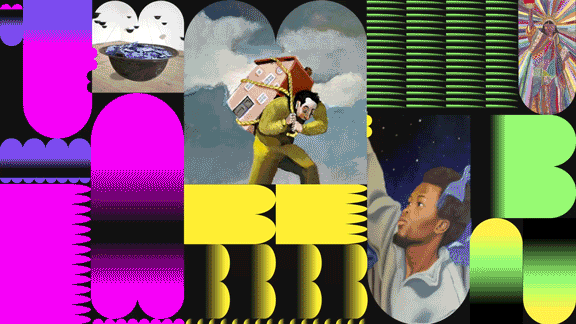
A Finalist at SCAD Secession 2019, Johnny Johnny is an experimental branding and editorial project that reimagines classic nursery rhymes through the lens of modern adolescence. By drawing unexpected cognitive connections between childhood stories and contemporary social issues, this project transforms didactic rhymes into thought-provoking cultural commentary. The final deliverable is a vinyl record and print piece, blending typography, art direction, and packaging design to engage young audiences navigating identity, peer pressure, and societal expectations.
🏆 Finalist – SCAD Secession 2019

Concept Development: From Word Maps to Visual Storytelling
The project began as an exploration of cognitive associations in Professor Rhonda Arntsen’s ‘Ideation Processes’ class. Through word mapping, I unearthed unexpected thematic connections between nursery rhymes, adolescence, and social issues. The resulting visual identity and packaging concept emerged from these insights.
Key Conceptual Themes
🔹 Young → Nursery Rhymes → Consume → Peer Pressure → Pretend → Teenage → Bullying → Conscience → Right vs. Wrong → Social Media → Education → School → Humiliation → Identity
This mapping exercise revealed a critical intersection—how moral lessons from childhood are challenged during adolescence, where social pressures and identity crises shape behavior.
The final concept aimed to:
Reinterpret classic nursery rhymes through a modern lens, placing them in the context of contemporary teenage experiences.
Use typography, music, and packaging to create a thought-provoking, multi-sensory experience.
Engage young audiences by juxtaposing nostalgic childhood motifs with pop culture, music, and social commentary.
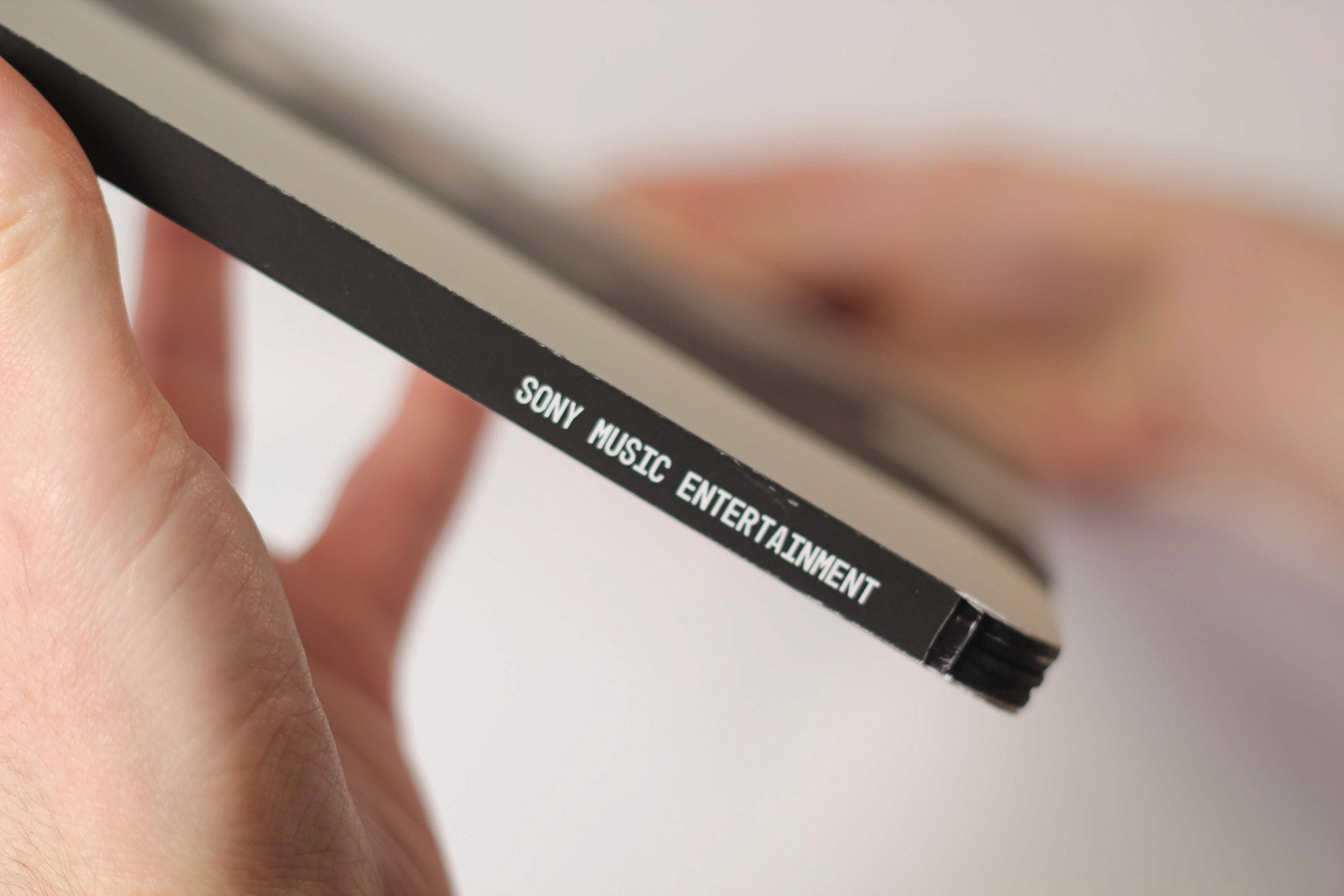
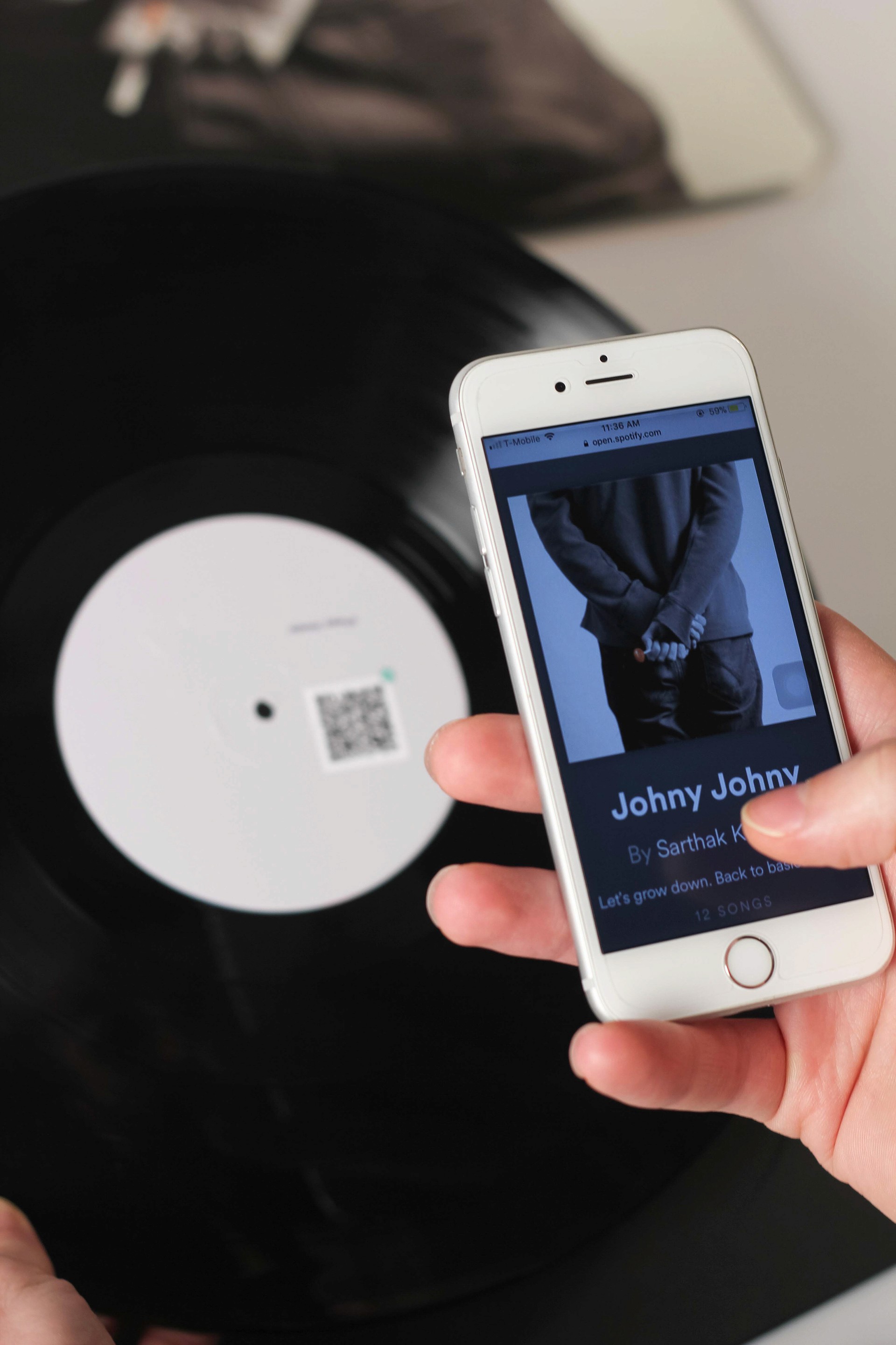
Medium & Execution: A Vinyl Record Experience
To appeal to Gen Z and young millennials, I chose a vinyl record format, capitalizing on its resurgence in popularity. The record features reimagined nursery rhymes, each visually and thematically paired with modern pop songs that explore similar themes.
Key Features
✅ Vinyl Record & Packaging: Juxtaposing childhood nostalgia with modern adolescent struggles.
✅ QR Code Integration: Linking to a curated Spotify playlist that enhances the thematic depth.
✅ Bold Typographic Storytelling: Layering nursery rhyme lyrics with grunge, neon, and hand-lettered typography to create a striking contrast between innocence and reality.
Key Spreads & Social Themes
Each spread contrasts a well-known nursery rhyme with a modern pop song, creating a visual and thematic dialogue around adolescent social issues.
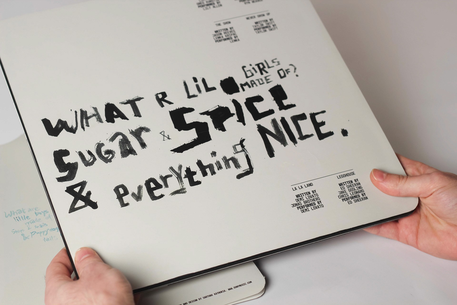
🎭 What Are We Made Of?
Nursery Rhyme: What Are Little Boys/Girls Made Of?
Pop Songs: Hard Out Here, Traveling Song, Never Grow Up
Design Approach: Delicate script vs. grunge brush-painted type to symbolize innocence vs. reality.
Social Issue: Gender norms, self-identity, societal expectations.
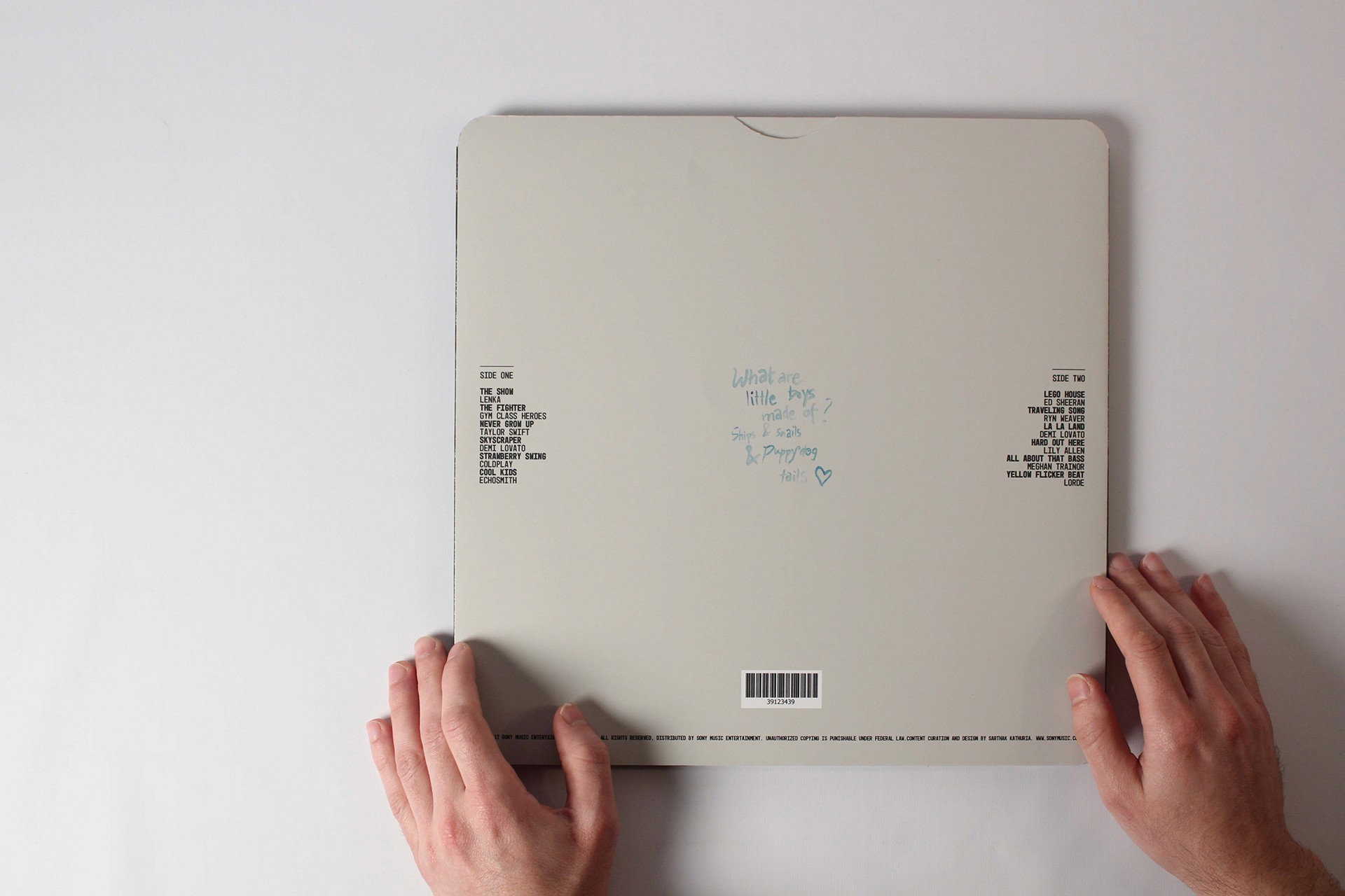
💃 Hot Cross Buns
Nursery Rhyme: Hot Cross Buns
Pop Songs: All About That Bass, Yellow Flicker Beat
Design Approach: Strip-club neon signage-inspired typography to emphasize body commodification.
Social Issue: Body image, self-worth, sexualization in media.


🍟 Humpty Dumpty
Nursery Rhyme: Humpty Dumpty
Pop Songs: Skyscraper, The Fighter
Design Approach: Typography arranged with French fries—a visual pun on fast-food culture and self-image.
Social Issue: Body shaming, eating disorders.

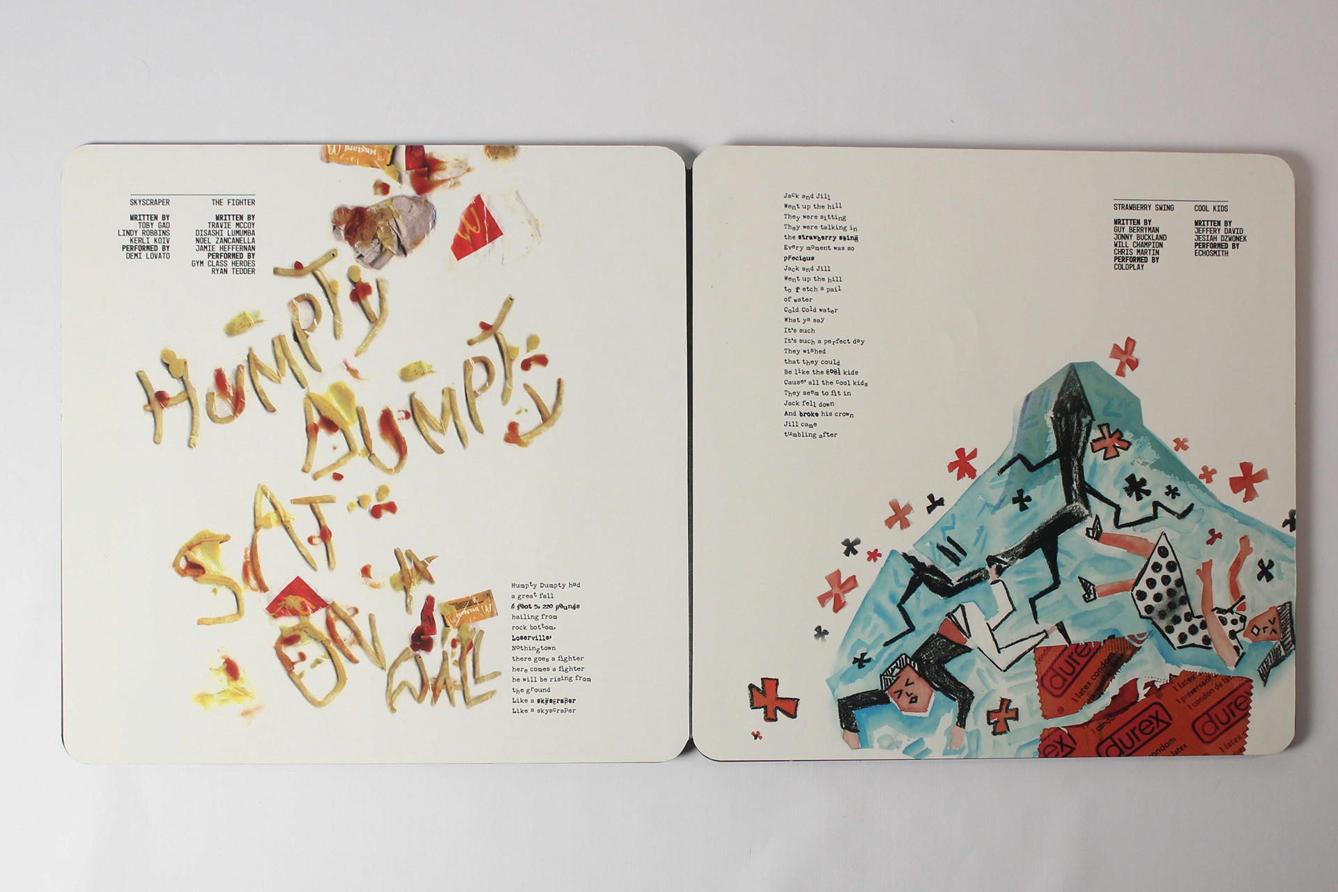
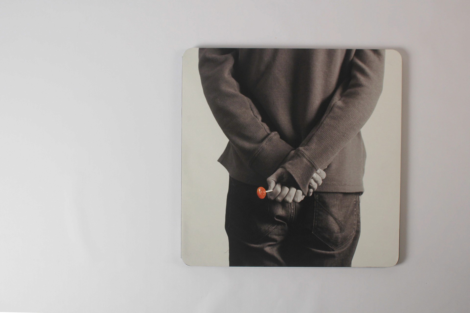
💔 Jack and Jill
Nursery Rhyme: Jack and Jill
Pop Songs: Strawberry Swing, Cool Kids
Design Approach: Collage with a broken condom as the ‘hill’ Jack and Jill fall from, referencing teenage risk-taking behaviors.
Social Issue: Teen pregnancy, peer pressure, and self-discovery.


Impact & Recognition
🎖️ Finalist at SCAD Secession 2019
✨ Explores the intersection of nostalgia, youth culture, and contemporary struggles
📢 A powerful conversation starter on the social realities of adolescence
Final Thoughts
Johnny Johnny was an opportunity to merge storytelling, music, and design into an interactive, thought-provoking piece. As a designer, I’ve always been fascinated by how childhood narratives evolve into real-world complexities—and this project allowed me to bridge that gap visually and conceptually. By combining editorial design, branding, and packaging, this project offers an immersive, multi-layered storytelling experience that resonates with a new generation navigating their own coming-of-age stories.
A Finalist at SCAD Secession 2019, Johnny Johnny is an experimental branding and editorial project that reimagines classic nursery rhymes through the lens of modern adolescence. By drawing unexpected cognitive connections between childhood stories and contemporary social issues, this project transforms didactic rhymes into thought-provoking cultural commentary. The final deliverable is a vinyl record and print piece, blending typography, art direction, and packaging design to engage young audiences navigating identity, peer pressure, and societal expectations.
🏆 Finalist – SCAD Secession 2019
Concept Development: From Word Maps to Visual Storytelling
The project began as an exploration of cognitive associations in Professor Rhonda Arntsen’s ‘Ideation Processes’ class. Through word mapping, I unearthed unexpected thematic connections between nursery rhymes, adolescence, and social issues. The resulting visual identity and packaging concept emerged from these insights.
Key Conceptual Themes
🔹 Young → Nursery Rhymes → Consume → Peer Pressure → Pretend → Teenage → Bullying → Conscience → Right vs. Wrong → Social Media → Education → School → Humiliation → Identity
This mapping exercise revealed a critical intersection—how moral lessons from childhood are challenged during adolescence, where social pressures and identity crises shape behavior.
The final concept aimed to:
Reinterpret classic nursery rhymes through a modern lens, placing them in the context of contemporary teenage experiences.
Use typography, music, and packaging to create a thought-provoking, multi-sensory experience.
Engage young audiences by juxtaposing nostalgic childhood motifs with pop culture, music, and social commentary.
Medium & Execution: A Vinyl Record Experience
To appeal to Gen Z and young millennials, I chose a vinyl record format, capitalizing on its resurgence in popularity. The record features reimagined nursery rhymes, each visually and thematically paired with modern pop songs that explore similar themes.
Key Features
✅ Vinyl Record & Packaging: Juxtaposing childhood nostalgia with modern adolescent struggles.
✅ QR Code Integration: Linking to a curated Spotify playlist that enhances the thematic depth.
✅ Bold Typographic Storytelling: Layering nursery rhyme lyrics with grunge, neon, and hand-lettered typography to create a striking contrast between innocence and reality.
Key Spreads & Social Themes
Each spread contrasts a well-known nursery rhyme with a modern pop song, creating a visual and thematic dialogue around adolescent social issues.
🎭 What Are We Made Of?
Nursery Rhyme: What Are Little Boys/Girls Made Of?
Pop Songs: Hard Out Here, Traveling Song, Never Grow Up
Design Approach: Delicate script vs. grunge brush-painted type to symbolize innocence vs. reality.
Social Issue: Gender norms, self-identity, societal expectations.
💃 Hot Cross Buns
Nursery Rhyme: Hot Cross Buns
Pop Songs: All About That Bass, Yellow Flicker Beat
Design Approach: Strip-club neon signage-inspired typography to emphasize body commodification.
Social Issue: Body image, self-worth, sexualization in media.
🍟 Humpty Dumpty
Nursery Rhyme: Humpty Dumpty
Pop Songs: Skyscraper, The Fighter
Design Approach: Typography arranged with French fries—a visual pun on fast-food culture and self-image.
Social Issue: Body shaming, eating disorders.
💔 Jack and Jill
Nursery Rhyme: Jack and Jill
Pop Songs: Strawberry Swing, Cool Kids
Design Approach: Collage with a broken condom as the ‘hill’ Jack and Jill fall from, referencing teenage risk-taking behaviors.
Social Issue: Teen pregnancy, peer pressure, and self-discovery.
Impact & Recognition
🎖️ Finalist at SCAD Secession 2019
✨ Explores the intersection of nostalgia, youth culture, and contemporary struggles
📢 A powerful conversation starter on the social realities of adolescence
Final Thoughts
Johnny Johnny was an opportunity to merge storytelling, music, and design into an interactive, thought-provoking piece. As a designer, I’ve always been fascinated by how childhood narratives evolve into real-world complexities—and this project allowed me to bridge that gap visually and conceptually. By combining editorial design, branding, and packaging, this project offers an immersive, multi-layered storytelling experience that resonates with a new generation navigating their own coming-of-age stories.

Explore More Projects

Full Card Sweep
Branding · Digital Marketing · UI · Front-End Dev
NY Cocktail Co.
Branding · Digital Marketing · UI · Front-End Dev


Phigora
Branding · Experiential · Digital Marketing · UI
Typomania
Branding · Motion

Spellbound Wines
Branding · Motion · Digital Marketing · Experiential

Museum Without Borders
Branding · Motion · Digital Marketing · Experiential · Print
Explore More Projects
Full Card Sweep
Branding · Digital Marketing · UI · Front-End Dev
NY Cocktail Co.
Branding · Digital Marketing · UI · Front-End Dev
Phigora
Branding · Experiential · Digital Marketing · UI
Typomania
Branding · Motion
Spellbound Wines
Branding · Motion · Digital Marketing · Experiential
Museum Without Borders
Branding · Motion · Digital Marketing · Experiential · Print