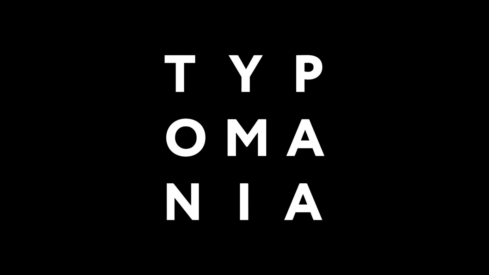
Typomania
Typomania
Branding · Motion
Bringing Type to Life: A Motion Media Tribute to Typomania
Bringing Type to Life: A Motion Media Tribute to Typomania
Project Timeline
Project Timeline
01/2018 - 04/2018
My Role
My Role
Visual Designer
Motion Designer
Team
Team
Mentor & Professor:
Minho Shin
Class:
Advanced Motion Media Techniques
Deliverables
Deliverables
Ideation
Visual Design
Promo Video Design
Overview
Typomania is an international festival celebrating typography in motion, bringing together designers, calligraphers, and lettering artists from around the world. For Professor Minho Shin’s Advanced Motion Media Techniques class, I created a promotional video that reimagines the festival’s bold, dynamic spirit through motion design.
Opportunity: A Festival That Lives and Breathes Typography
The Typomania Festival is a cultural and educational project dedicated to fonts, typography, calligraphy, and lettering, held annually in Moscow. More than just an event, Typomania aims to push the boundaries of typographic storytelling through lectures, exhibitions, workshops, and competitions.
For this project, I set out to create a festival promo video that not only showcased typography in motion but also captured the essence of Typomania—the idea that type is not static but a living, breathing part of our visual culture.
Final Video
View it with sound on here.
Moodboards & Research: Inspired by Constructivism
As the home of Typomania, Russia has a deep visual and artistic history. I drew inspiration from Russian Constructivism, a movement that rejected traditional autonomous art in favor of bold, geometric compositions designed for social impact.
🔹 Key Influences:
Vladimir Tatlin & El Lissitzky’s Constructivist Art – Bold, experimental layouts and dynamic movement.
Old Russian Cinema – Montage techniques and kinetic type storytelling.
Typomania’s Mission – A festival that treats typography as an evolving, interactive art form.


Visual Language: Typefaces & Color Palette
Typography choices were made in accordance with Constructivist principles, using bold, industrial-inspired fonts that command attention.
The color palette was kept minimal—black, red, and white, reflecting the raw, graphic aesthetic of early Soviet posters.

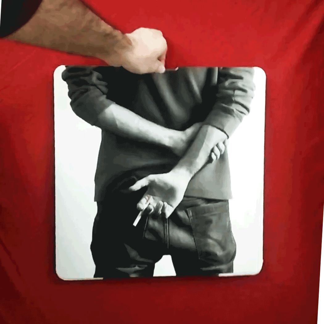
Motion Design: Final Styleframes
Dynamic Type Animations – Letters stretch, break apart, and reconstruct, mirroring the fluidity of language.
Kinetic Motion – Words move with purpose, inspired by the way we consume type daily—on screens, in books, in signage.

Final Thoughts: Celebrating Typomania Through Motion
This project was a true exploration of typographic storytelling, blending historical influences with modern motion design. By infusing the Constructivist spirit into dynamic motion graphics, the promo video became more than just an advertisement—it was an extension of Typomania’s mission.
🔹 Key Takeaways:
Typography is not just a design element—it’s a powerful tool for storytelling and movement.
Motion media can breathe life into type, making it feel as active as spoken language.
Constructivism’s principles—bold form, structured chaos, and social impact—still resonate in contemporary design.
This project was a tribute to Typomania, a festival that proves typography isn’t just seen—it’s experienced.
Overview
Typomania is an international festival celebrating typography in motion, bringing together designers, calligraphers, and lettering artists from around the world. For Professor Minho Shin’s Advanced Motion Media Techniques class, I created a promotional video that reimagines the festival’s bold, dynamic spirit through motion design.
Opportunity: A Festival That Lives and Breathes Typography
The Typomania Festival is a cultural and educational project dedicated to fonts, typography, calligraphy, and lettering, held annually in Moscow. More than just an event, Typomania aims to push the boundaries of typographic storytelling through lectures, exhibitions, workshops, and competitions.
For this project, I set out to create a festival promo video that not only showcased typography in motion but also captured the essence of Typomania—the idea that type is not static but a living, breathing part of our visual culture.
Final Video
View it with sound on here.
Moodboards & Research: Inspired by Constructivism
As the home of Typomania, Russia has a deep visual and artistic history. I drew inspiration from Russian Constructivism, a movement that rejected traditional autonomous art in favor of bold, geometric compositions designed for social impact.
🔹 Key Influences:
Vladimir Tatlin & El Lissitzky’s Constructivist Art – Bold, experimental layouts and dynamic movement.
Old Russian Cinema – Montage techniques and kinetic type storytelling.
Typomania’s Mission – A festival that treats typography as an evolving, interactive art form.
Visual Language: Typefaces & Color Palette
Typography choices were made in accordance with Constructivist principles, using bold, industrial-inspired fonts that command attention.
The color palette was kept minimal—black, red, and white, reflecting the raw, graphic aesthetic of early Soviet posters.
Motion Design: Final Styleframes
Dynamic Type Animations – Letters stretch, break apart, and reconstruct, mirroring the fluidity of language.
Kinetic Motion – Words move with purpose, inspired by the way we consume type daily—on screens, in books, in signage.
Final Thoughts: Celebrating Typomania Through Motion
This project was a true exploration of typographic storytelling, blending historical influences with modern motion design. By infusing the Constructivist spirit into dynamic motion graphics, the promo video became more than just an advertisement—it was an extension of Typomania’s mission.
🔹 Key Takeaways:
Typography is not just a design element—it’s a powerful tool for storytelling and movement.
Motion media can breathe life into type, making it feel as active as spoken language.
Constructivism’s principles—bold form, structured chaos, and social impact—still resonate in contemporary design.
This project was a tribute to Typomania, a festival that proves typography isn’t just seen—it’s experienced.

Explore More Projects

Johnny Johnny
Branding · Art Direction · Print · Packaging

Full Card Sweep
Branding · Digital Marketing · UI · Front-End Dev
NY Cocktail Co.
Branding · Digital Marketing · UI · Front-End Dev


Phigora
Branding · Experiential · Digital Marketing · UI

Spellbound Wines
Branding · Motion · Digital Marketing · Experiential

Museum Without Borders
Branding · Motion · Digital Marketing · Experiential · Print
Explore More Projects
Johnny Johnny
Branding · Art Direction · Print · Packaging
Full Card Sweep
Branding · Digital Marketing · UI · Front-End Dev
NY Cocktail Co.
Branding · Digital Marketing · UI · Front-End Dev
Phigora
Branding · Experiential · Digital Marketing · UI
Spellbound Wines
Branding · Motion · Digital Marketing · Experiential
Museum Without Borders
Branding · Motion · Digital Marketing · Experiential · Print