Camp
Camp
Branding · Motion · Print · UI · Front-End Dev

Designing a Brand and Digital Presence for CAMP
Designing a Brand and Digital Presence for CAMP
Project Timeline
Project Timeline
11/2019 - 03/2020
My Role
My Role
Brand Designer
Visual Designer
UI Designer
Interaction Designer
Front-End Designer
Team
Team
CEO:
Anthony Robeson
COO:
Maybel Ovalles
Deliverables
Deliverables
Brand Identity
Brand Guidelines
Poster Design
Social Media Templates
UX Design
UI Design
Responsive Website
A Cultural Hub Rooted in Community and Change
CAMP is more than just a space—it’s a center for communities, art, change, and the future. Rooted in the spirit of inclusivity and social impact, it has made commitments to ally with the Zipoliteño community, respect the natural environment, and create a safer space for people of all identities.
As a freelance designer, I was entrusted with shaping CAMP’s brand identity from the ground up, activating its presence across print, digital, and social media, and designing and developing a responsive website to reflect its mission.

Immersing in the Space: A Visual Foundation
To truly capture the essence of CAMP, I started with a video study—a compilation of raw, authentic footage shot by the Chief Architect, Anthony. This helped me experience the space remotely, absorbing its textures, architecture, and organic flow.
From this visual exercise, I developed a brand identity that balances geometric structure with natural forms, reflecting the interplay between CAMP’s physical space and its guiding philosophy.
Brand Identity: A Visual Language Inspired by Space
CAMP’s identity needed to feel grounded yet expansive, embracing its commitment to transformation and inclusivity.

Logo & Brandmark
The final logo was inspired by the architectural structures of CAMP—‘talapas’ (roof formations) found throughout the site. The exploration process included various iterations that played with geometric abstraction, eventually refining a clean yet dynamic mark that resonated deeply with Anthony and the team.
Color Palette & Visual Aesthetic
The color palette was derived from the natural surroundings of Zipolite—earthy tones juxtaposed with deep blues and sun-washed hues. The visual system balances raw simplicity with structured geometry, a nod to the architectural foundations of CAMP while maintaining an organic, open feel.

Bringing CAMP to Life Across Digital & Print
With a strong identity in place, I extended the design language to posters, print collateral, and social media assets, ensuring a consistent and immersive brand experience.
Posters & Print Design: Promotional materials blended bold, structured layouts with fluid, natural elements, emphasizing CAMP’s duality of structure and freedom.
Social Media Strategy: I designed templates that allowed CAMP to share updates, events, and artist residencies in a way that felt engaging yet aligned with its minimalist ethos.


Website Design: A Digital Gateway to CAMP
The business goal for the website was to create a clear, Wikipedia-like resource for visitors, artists, and collaborators. The website needed to outline CAMP’s mission, showcase artists-in-residence, and provide essential visitor information.
Final Website Development
Built using Cargo Collective, ensuring a lightweight and responsive experience.
Minimalist single-page scroll navigation, designed to guide users through CAMP’s mission seamlessly.
A full-screen slider interaction, improving segmentation and clarity for visitors.
Embedded video as a backdrop, immersing users in CAMP’s atmosphere even before they arrive.

Inclusive & Equity-Focused Design
One of the key insights from secondary research was that a significant portion of CAMP’s audience were Spanish speakers. To uphold CAMP’s values of inclusivity and accessibility, I implemented:
Bilingual site functionality, allowing users to switch between English and Spanish seamlessly.
UX choices informed by real-world user testing, ensuring cultural sensitivity and intuitive navigation.
Final Thoughts & Client Impact
Throughout the process, CAMP’s CEO, Anthony Robeson, played an invaluable role, providing connections for user research and usability testing. His collaboration helped validate design decisions, ensuring they truly aligned with CAMP’s real-world needs.
Though this was initially a class project, the impact extended far beyond. CAMP’s internal brand and dev team adopted much of our work, and you can see our design choices reflected in their current website. This project remains one of the most meaningful applications of design for social good I’ve worked on, proving that thoughtful design can shape not just brands, but entire communities.
A Cultural Hub Rooted in Community and Change
CAMP is more than just a space—it’s a center for communities, art, change, and the future. Rooted in the spirit of inclusivity and social impact, it has made commitments to ally with the Zipoliteño community, respect the natural environment, and create a safer space for people of all identities.
As a freelance designer, I was entrusted with shaping CAMP’s brand identity from the ground up, activating its presence across print, digital, and social media, and designing and developing a responsive website to reflect its mission.
Immersing in the Space: A Visual Foundation
To truly capture the essence of CAMP, I started with a video study—a compilation of raw, authentic footage shot by the Chief Architect, Anthony. This helped me experience the space remotely, absorbing its textures, architecture, and organic flow.
From this visual exercise, I developed a brand identity that balances geometric structure with natural forms, reflecting the interplay between CAMP’s physical space and its guiding philosophy.
Brand Identity: A Visual Language Inspired by Space
CAMP’s identity needed to feel grounded yet expansive, embracing its commitment to transformation and inclusivity.
Logo & Brandmark
The final logo was inspired by the architectural structures of CAMP—‘talapas’ (roof formations) found throughout the site. The exploration process included various iterations that played with geometric abstraction, eventually refining a clean yet dynamic mark that resonated deeply with Anthony and the team.
Color Palette & Visual Aesthetic
The color palette was derived from the natural surroundings of Zipolite—earthy tones juxtaposed with deep blues and sun-washed hues. The visual system balances raw simplicity with structured geometry, a nod to the architectural foundations of CAMP while maintaining an organic, open feel.
Bringing CAMP to Life Across Digital & Print
With a strong identity in place, I extended the design language to posters, print collateral, and social media assets, ensuring a consistent and immersive brand experience.
Posters & Print Design: Promotional materials blended bold, structured layouts with fluid, natural elements, emphasizing CAMP’s duality of structure and freedom.
Social Media Strategy: I designed templates that allowed CAMP to share updates, events, and artist residencies in a way that felt engaging yet aligned with its minimalist ethos.
Website Design: A Digital Gateway to CAMP
The business goal for the website was to create a clear, Wikipedia-like resource for visitors, artists, and collaborators. The website needed to outline CAMP’s mission, showcase artists-in-residence, and provide essential visitor information.
Final Website Development
Built using Cargo Collective, ensuring a lightweight and responsive experience.
Minimalist single-page scroll navigation, designed to guide users through CAMP’s mission seamlessly.
A full-screen slider interaction, improving segmentation and clarity for visitors.
Embedded video as a backdrop, immersing users in CAMP’s atmosphere even before they arrive.
Inclusive & Equity-Focused Design
One of the key insights from secondary research was that a significant portion of CAMP’s audience were Spanish speakers. To uphold CAMP’s values of inclusivity and accessibility, I implemented:
Bilingual site functionality, allowing users to switch between English and Spanish seamlessly.
UX choices informed by real-world user testing, ensuring cultural sensitivity and intuitive navigation.
Final Thoughts & Client Impact
Throughout the process, CAMP’s CEO, Anthony Robeson, played an invaluable role, providing connections for user research and usability testing. His collaboration helped validate design decisions, ensuring they truly aligned with CAMP’s real-world needs.
Though this was initially a class project, the impact extended far beyond. CAMP’s internal brand and dev team adopted much of our work, and you can see our design choices reflected in their current website. This project remains one of the most meaningful applications of design for social good I’ve worked on, proving that thoughtful design can shape not just brands, but entire communities.

Explore More Projects

Johnny Johnny
Branding · Art Direction · Print · Packaging

Full Card Sweep
Branding · Digital Marketing · UI · Front-End Dev
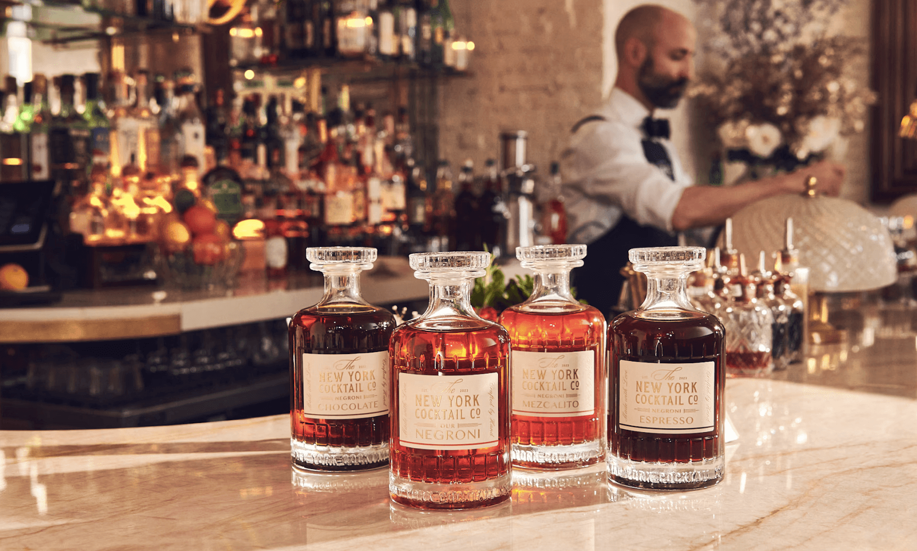
NY Cocktail Co.
Branding · Digital Marketing · UI · Front-End Dev


Phigora
Branding · Experiential · Digital Marketing · UI
Typomania
Branding · Motion

Spellbound Wines
Branding · Motion · Digital Marketing · Experiential
Explore More Projects
Johnny Johnny
Branding · Art Direction · Print · Packaging
Full Card Sweep
Branding · Digital Marketing · UI · Front-End Dev
NY Cocktail Co.
Branding · Digital Marketing · UI · Front-End Dev
Phigora
Branding · Experiential · Digital Marketing · UI
Typomania
Branding · Motion
Spellbound Wines
Branding · Motion · Digital Marketing · Experiential