SATA
SATA
UX · UI · Motion · Front-End Dev · Branding
From Concept to Court: Redesigning SATA's Website for a More Inclusive & Accessible Tennis Community
From Concept to Court: Redesigning SATA's Website for a More Inclusive & Accessible Tennis Community
Project Timeline
Project Timeline
05/2017 - 07/2017
My Role
My Role
Visual Designer
UX Designer
UI Designer
Interaction Designer
Front-End Developer
Team
Team
Brand Designer:
Natalie Budiman
UX Researcher:
Lindsey Peterson
Mentor & Professor:
Joseph DiGioia
Deliverables
Deliverables
Ideation
Brand Identity
UX Research
Lo-Fi Prototypes
UI Design
Data Visualization
Front-End Development
Website Launch
Opportunity
Savannah Area Tennis Association (SATA) is a non-profit dedicated to promoting tennis and healthy living in Savannah, GA. Despite its positive impact, its existing website failed to connect with a modern audience and lacked essential functionalities that could engage a broader user base.
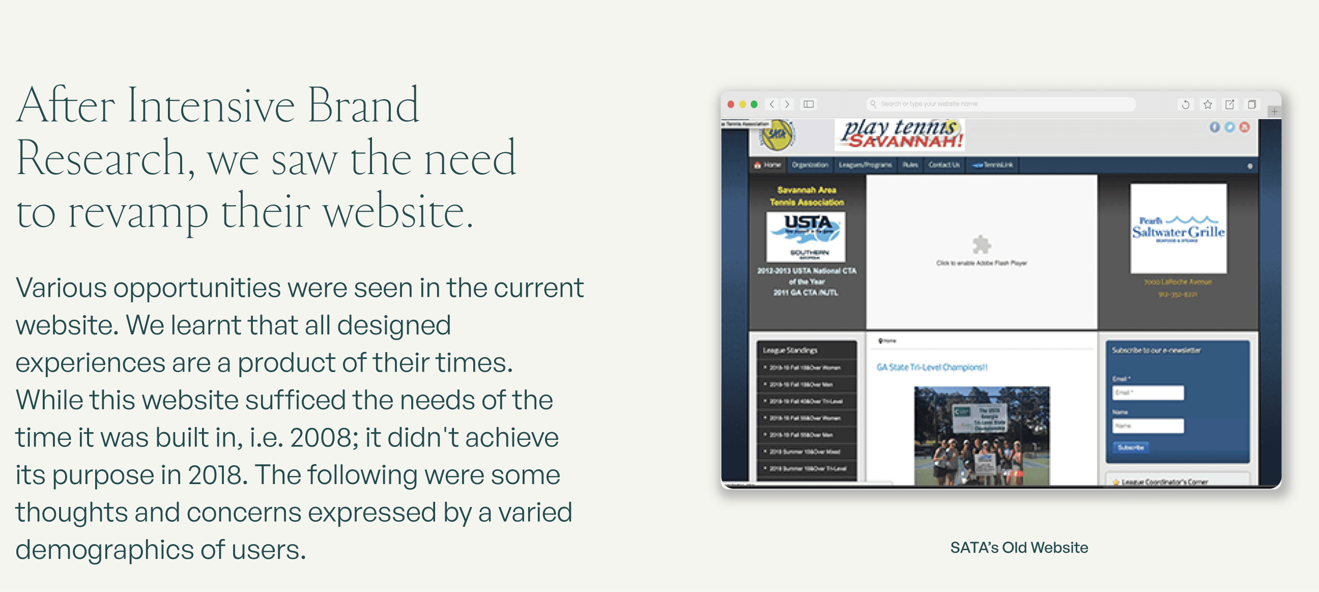
Research & Pain Points
As a subset of the United States Tennis Association (USTA), SATA organizes competitive league play, outreach programs, and tennis events for all people. With over 1400 members, SATA’s goal is to grow tennis and use it as a means to advance the health and well-being of individuals and the Savannah community as a whole. SATA believes tennis is for everyone, and strives to provide a variety of programs that seek to reach the underserved populations of Savannah.
Through empathy interviews, usability testing, and heuristic evaluations, we uncovered several pain points in the old website:

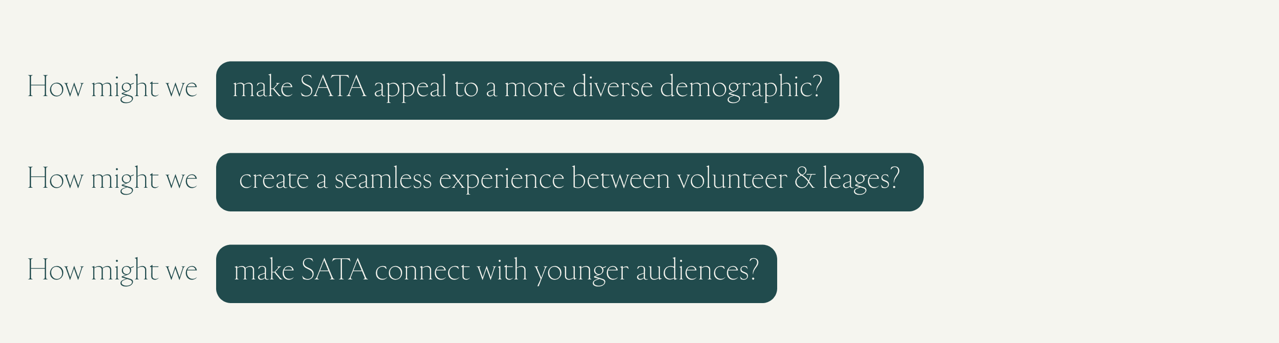
Problem Definition
Our goal was to redesign SATA’s digital experience to address these pain points and answer key UX questions:
Prototyping
One of the most crucial steps in our design process was iterative prototyping. Using Figma, we created wireframes and interactive prototypes to test user flows and navigation structures. View complete process here.
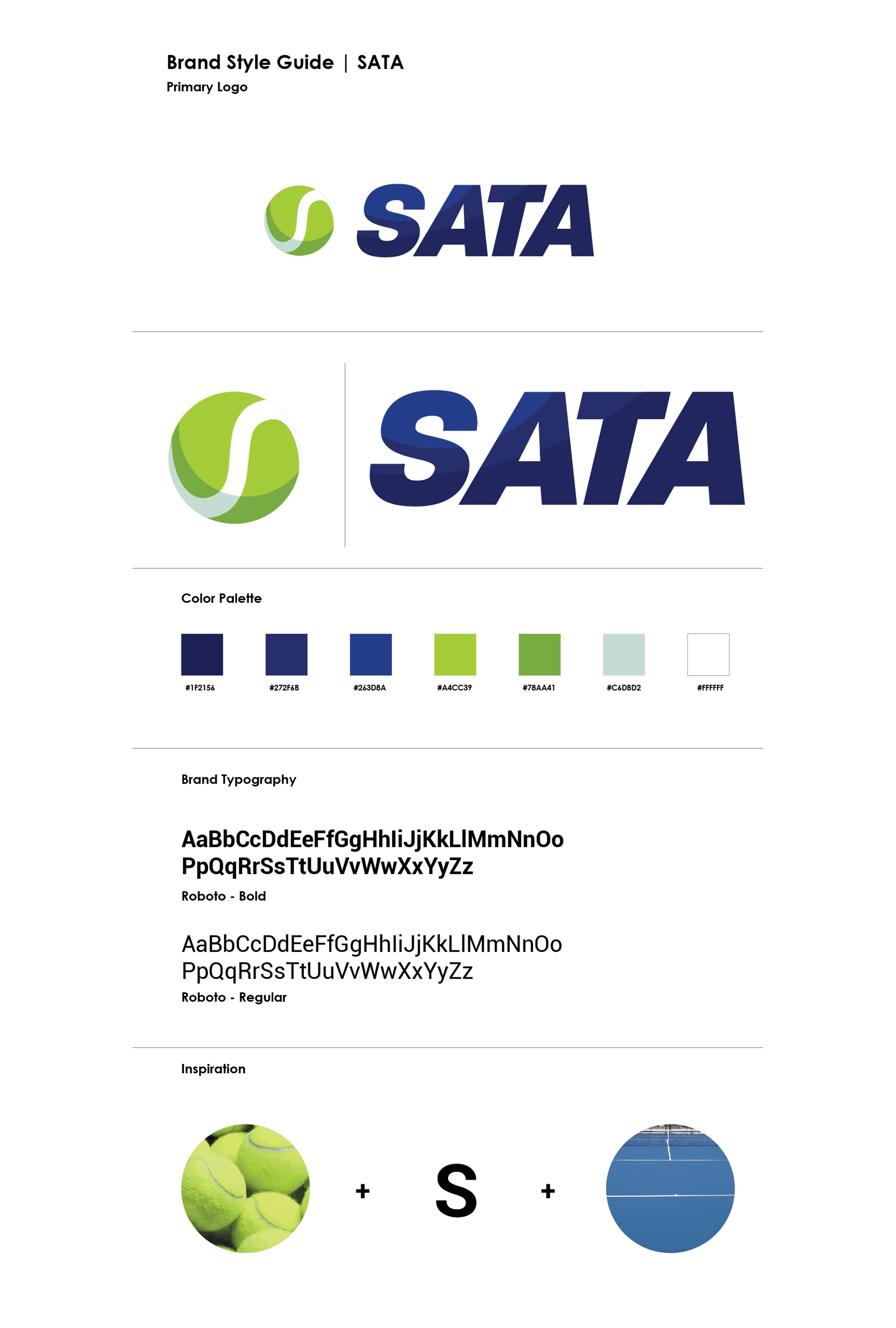
Visual Identity
To align with the community-first ethos of SATA, we developed a modern and dynamic brand identity that balanced professionalism with inclusivity.
Color Palette: Inspired by the green-blue tones of tennis courts and the vibrant yellow of a tennis ball, reinforcing energy and movement.
Typography: A blend of bold, modern sans-serifs, making the experience feel fresh yet approachable.
Imagery: Increased emphasis on real people playing tennis, shifting the perception from a technical sport to a social, community-driven activity.

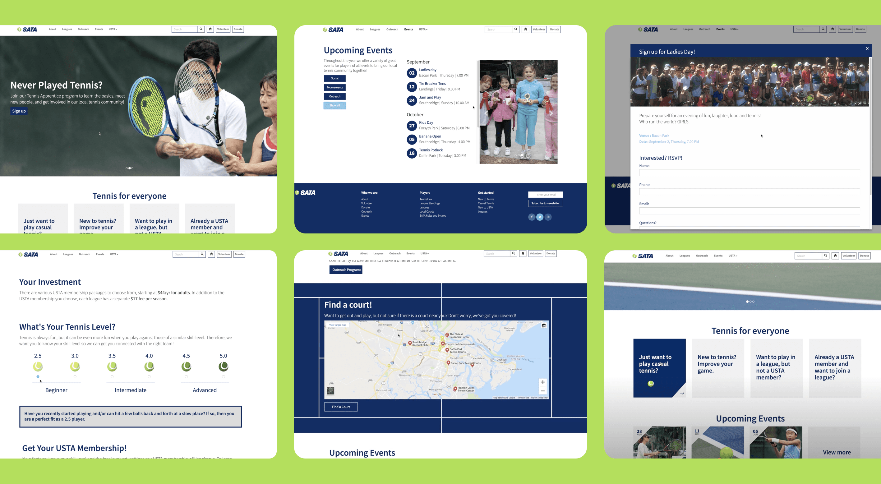
The Solution: The Redesigned SATA Website
After exhaustive prototyping, the final website experience was coded from scratch by me using the framework of Dreamweaver and Bootstrap.
Redesigned User Pathways
One of our key innovations was four distinct user pathways—for players, volunteers, donors, and event organizers—allowing a customized user experience and positioning SATA as the ultimate hub for tennis in Savannah.
Live Events Page with Filters
To make tournaments, community matches, and league events more accessible, we designed an integrated live events page with smart filters, reducing friction in finding relevant matches and sign-ups.
A Story-Driven About Page
To humanize SATA’s mission, we introduced a richly detailed About Page, narrating the organization’s journey, impact, and values—a crucial addition missing in the old website.
Volunteer & Donate Call-to-Actions (CTAs)
Since SATA thrives on community support, we ensured volunteering and donations were always within reach:
Primary CTA buttons were added to the sticky navigation bar, eliminating the need to navigate away from the current page.
Pop-up modals allowed users to sign up or contribute without disrupting their browsing experience.
Simplified USTA Ratings System
The complex tennis rating system was one of the most confusing elements for new users. We created an interactive, step-by-step guide that broke down the USTA ranking process into digestible, visual sections.
Final Thoughts
The redesigned SATA website successfully transformed a fragmented digital experience into a dynamic, user-friendly hub. The project was well received by the SATA board and users, significantly improving engagement, usability, and overall accessibility.
John Mauro, Executive Director of SATA, was an instrumental partner throughout the project. He collaborated closely with our team, providing valuable connections for user testing and usability studies with actual tennis players in Savannah. His insights were critical in refining the design to meet the real-world needs of the community.
John commended our team’s dedication and hard work, particularly appreciating our final design handoff to SATA’s internal brand and development team. Although this was initially a class project, SATA implemented many of our recommended changes to their digital presence. Their current live website retains key elements of our research, UX strategy, and visual identity, reinforcing the impact and longevity of our work.
Opportunity
Savannah Area Tennis Association (SATA) is a non-profit dedicated to promoting tennis and healthy living in Savannah, GA. Despite its positive impact, its existing website failed to connect with a modern audience and lacked essential functionalities that could engage a broader user base.
Research & Pain Points
As a subset of the United States Tennis Association (USTA), SATA organizes competitive league play, outreach programs, and tennis events for all people. With over 1400 members, SATA’s goal is to grow tennis and use it as a means to advance the health and well-being of individuals and the Savannah community as a whole. SATA believes tennis is for everyone, and strives to provide a variety of programs that seek to reach the underserved populations of Savannah.
Through empathy interviews, usability testing, and heuristic evaluations, we uncovered several pain points in the old website:
Problem Definition
Our goal was to redesign SATA’s digital experience to address these pain points and answer key UX questions:
Prototyping
One of the most crucial steps in our design process was iterative prototyping. Using Figma, we created wireframes and interactive prototypes to test user flows and navigation structures. View complete process here.
Visual Identity
To align with the community-first ethos of SATA, we developed a modern and dynamic brand identity that balanced professionalism with inclusivity.
Color Palette: Inspired by the green-blue tones of tennis courts and the vibrant yellow of a tennis ball, reinforcing energy and movement.
Typography: A blend of bold, modern sans-serifs, making the experience feel fresh yet approachable.
Imagery: Increased emphasis on real people playing tennis, shifting the perception from a technical sport to a social, community-driven activity.
The Solution: The Redesigned SATA Website
After exhaustive prototyping, the final website experience was coded from scratch by me using the framework of Dreamweaver and Bootstrap.
Redesigned User Pathways
One of our key innovations was four distinct user pathways—for players, volunteers, donors, and event organizers—allowing a customized user experience and positioning SATA as the ultimate hub for tennis in Savannah.
Live Events Page with Filters
To make tournaments, community matches, and league events more accessible, we designed an integrated live events page with smart filters, reducing friction in finding relevant matches and sign-ups.
A Story-Driven About Page
To humanize SATA’s mission, we introduced a richly detailed About Page, narrating the organization’s journey, impact, and values—a crucial addition missing in the old website.
Volunteer & Donate Call-to-Actions (CTAs)
Since SATA thrives on community support, we ensured volunteering and donations were always within reach:
Primary CTA buttons were added to the sticky navigation bar, eliminating the need to navigate away from the current page.
Pop-up modals allowed users to sign up or contribute without disrupting their browsing experience.
Simplified USTA Ratings System
The complex tennis rating system was one of the most confusing elements for new users. We created an interactive, step-by-step guide that broke down the USTA ranking process into digestible, visual sections.
Final Thoughts
The redesigned SATA website successfully transformed a fragmented digital experience into a dynamic, user-friendly hub. The project was well received by the SATA board and users, significantly improving engagement, usability, and overall accessibility.
John Mauro, Executive Director of SATA, was an instrumental partner throughout the project. He collaborated closely with our team, providing valuable connections for user testing and usability studies with actual tennis players in Savannah. His insights were critical in refining the design to meet the real-world needs of the community.
John commended our team’s dedication and hard work, particularly appreciating our final design handoff to SATA’s internal brand and development team. Although this was initially a class project, SATA implemented many of our recommended changes to their digital presence. Their current live website retains key elements of our research, UX strategy, and visual identity, reinforcing the impact and longevity of our work.

Explore More Projects

Johnny Johnny
Branding · Art Direction · Print · Packaging


Full Card Sweep
Branding · Digital Marketing · UI · Front-End Dev
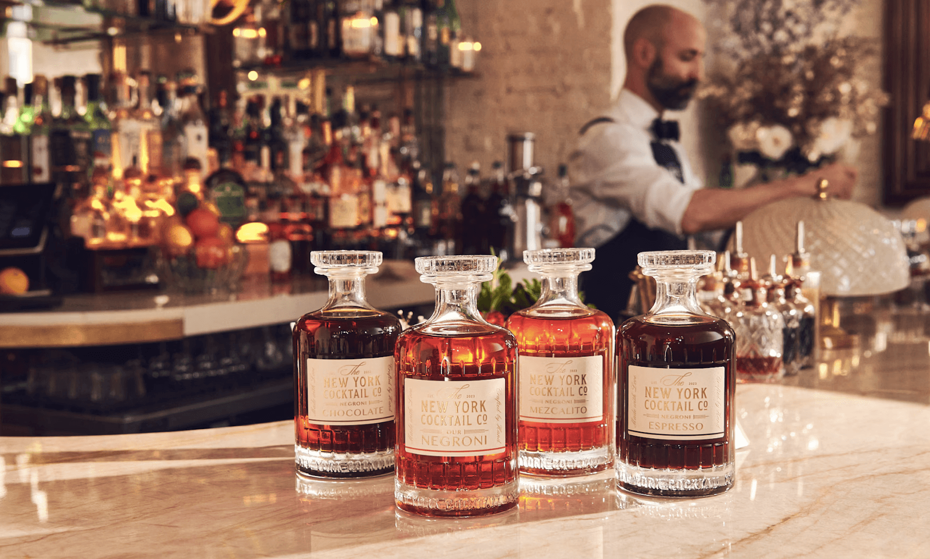
NY Cocktail Co.
Branding · Digital Marketing · UI · Front-End Dev


Phigora
Branding · Experiential · Digital Marketing · UI

Typomania
Branding · Motion


Spellbound Wines
Branding · Motion · Digital Marketing · Experiential
Explore More Projects
Johnny Johnny
Branding · Art Direction · Print · Packaging
Full Card Sweep
Branding · Digital Marketing · UI · Front-End Dev
NY Cocktail Co.
Branding · Digital Marketing · UI · Front-End Dev
Phigora
Branding · Experiential · Digital Marketing · UI
Typomania
Branding · Motion
Spellbound Wines
Branding · Motion · Digital Marketing · Experiential