Spectrum
Spectrum
UX · UI · Front-End Dev
Spectrum: An Interactive Exploration of Designer-User Dynamics
Spectrum: An Interactive Exploration of Designer-User Dynamics
Project Timeline
Project Timeline
08/2018 - 12/2018
My Role
My Role
Visual Designer
Interaction Designer
Front End Developer
Team
Team
Mentor & Professor:
Joseph DiGioia
Class:
Thesis II - Concepting & Visualization
Deliverables
Deliverables
Ideation
Brand Identity
Wireframes
Prototypes
UI Design
Website
Opportunity
We live in a Times-Square-like era, where we are constantly bombarded with visual content. This saturation makes mindful curation essential—especially for visual designers who are shaped by what they consume. Spectrum was born from my MFA thesis, which explored the role of poeticity in graphic design, aiming to rethink the balance of designer control vs. user agency in digital experiences. The goal was to develop an interactive platform that translates these conceptual themes into an intuitive, dynamic experience.

Interaction Design
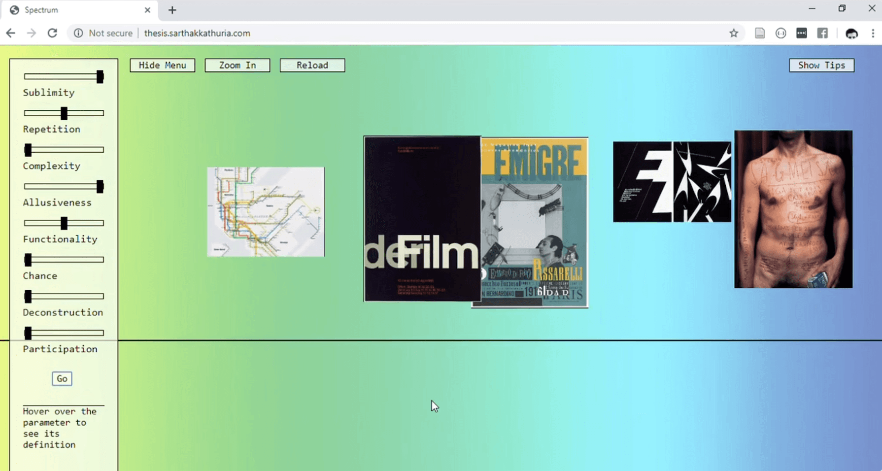
To illustrate the fluidity between designer and user influence, I devised a system of interactive filters/sliders—similar to an e-commerce shopping interface—allowing users to adjust variables that shape the experience. The sliders reflect key factors that define whether a design is more designer-driven or user-driven:

Designer-Dominant Factors
Sublimity: Measures spirituality in the design process.
Repetition: Evaluates recurring themes, styles, and voice.
Complexity: Assesses the intricacy of the experience.
Allusiveness: Tracks the use of rhetorical and poetic tools.
User-Dominant Factors
Functionality: Determines usability and accessibility.
Chance: Gauges spontaneity in design.
Deconstruction: Examines the breaking of conventional models.
Participation: Measures inclusivity and interactivity.
Prototyping & User Flow
At the heart of Spectrum was the challenge of visualizing the balance between designer and user influence. The goal was to create an interface that allowed users to actively manipulate design variables, rather than passively consume content. This led to the development of two successful prototypes, each exploring different approaches to accessibility and usability.
Prototype 1: Fixed Filter Areas
In this version, I positioned Designer-Dominant Factors on the left corner and User-Dominant Factors on the right. This mirrored the conceptual tug-of-war between designer control and user freedom, reinforcing the idea of a spectrum rather than a hierarchy. While this prototype visually communicated the core concept effectively, user testing revealed cognitive friction—users found it difficult to adjust settings across both sides seamlessly.

Prototype 2: Unified Variable Panel
To address usability concerns, I restructured the interface, placing all variable controls on one side of the screen. This made it easier for users to adjust multiple factors at once, enhancing efficiency and accessibility. The simplified interaction model allowed users to focus on exploration rather than navigation, ensuring a smoother and more intuitive experience.

Usability Testing & Iteration
Through user testing, Prototype 2 proved significantly more effective in guiding users through the experience. Participants reported:
Faster navigation and easier adjustments when all controls were in one place.
Increased engagement, as they were more inclined to experiment with different filter combinations.
Stronger understanding of how the variables shaped their experience.
With these insights, Prototype 2 was refined and moved into the final design and development stages, setting the foundation for an experience that was both conceptually strong and user-friendly.
This structured prototyping phase ensured that Spectrum was not just an abstract concept, but a functional and engaging interactive tool that effectively communicated the dynamics of designer and user agency.
Final Product
The final experience was coded from scratch using P5.JS, integrating dynamic, responsive elements that adapt to user input.


Slider-Based Exploration
Interactive filters allow users to adjust design parameters, creating a personalized browsing experience.
Welcome Screen
Users are guided through an introductory interface that explains how to navigate the platform.
Zoom-Out Interaction
A parallax scrolling effect helps users visualize past and present searches, reinforcing the concept of design evolution and mindful content curation.
Impact
Spectrum successfully transformed an abstract thesis into a tangible, interactive tool, making designer-user dynamics more accessible and experiential. By merging UI, UX, and front-end development, the project reimagines the role of user agency in digital design, offering a fresh perspective on how we interact with visual content.
Opportunity
We live in a Times-Square-like era, where we are constantly bombarded with visual content. This saturation makes mindful curation essential—especially for visual designers who are shaped by what they consume. Spectrum was born from my MFA thesis, which explored the role of poeticity in graphic design, aiming to rethink the balance of designer control vs. user agency in digital experiences. The goal was to develop an interactive platform that translates these conceptual themes into an intuitive, dynamic experience.
Interaction Design
To illustrate the fluidity between designer and user influence, I devised a system of interactive filters/sliders—similar to an e-commerce shopping interface—allowing users to adjust variables that shape the experience. The sliders reflect key factors that define whether a design is more designer-driven or user-driven:
Designer-Dominant Factors
Sublimity: Measures spirituality in the design process.
Repetition: Evaluates recurring themes, styles, and voice.
Complexity: Assesses the intricacy of the experience.
Allusiveness: Tracks the use of rhetorical and poetic tools.
User-Dominant Factors
Functionality: Determines usability and accessibility.
Chance: Gauges spontaneity in design.
Deconstruction: Examines the breaking of conventional models.
Participation: Measures inclusivity and interactivity.
Prototyping & User Flow
At the heart of Spectrum was the challenge of visualizing the balance between designer and user influence. The goal was to create an interface that allowed users to actively manipulate design variables, rather than passively consume content. This led to the development of two successful prototypes, each exploring different approaches to accessibility and usability.
Prototype 1: Fixed Filter Areas
In this version, I positioned Designer-Dominant Factors on the left corner and User-Dominant Factors on the right. This mirrored the conceptual tug-of-war between designer control and user freedom, reinforcing the idea of a spectrum rather than a hierarchy. While this prototype visually communicated the core concept effectively, user testing revealed cognitive friction—users found it difficult to adjust settings across both sides seamlessly.
Prototype 2: Unified Variable Panel
To address usability concerns, I restructured the interface, placing all variable controls on one side of the screen. This made it easier for users to adjust multiple factors at once, enhancing efficiency and accessibility. The simplified interaction model allowed users to focus on exploration rather than navigation, ensuring a smoother and more intuitive experience.
Usability Testing & Iteration
Through user testing, Prototype 2 proved significantly more effective in guiding users through the experience. Participants reported:
Faster navigation and easier adjustments when all controls were in one place.
Increased engagement, as they were more inclined to experiment with different filter combinations.
Stronger understanding of how the variables shaped their experience.
With these insights, Prototype 2 was refined and moved into the final design and development stages, setting the foundation for an experience that was both conceptually strong and user-friendly.
This structured prototyping phase ensured that Spectrum was not just an abstract concept, but a functional and engaging interactive tool that effectively communicated the dynamics of designer and user agency.
Final Product
The final experience was coded from scratch using P5.JS, integrating dynamic, responsive elements that adapt to user input.
Slider-Based Exploration
Interactive filters allow users to adjust design parameters, creating a personalized browsing experience.
Welcome Screen
Users are guided through an introductory interface that explains how to navigate the platform.
Zoom-Out Interaction
A parallax scrolling effect helps users visualize past and present searches, reinforcing the concept of design evolution and mindful content curation.
Impact
Spectrum successfully transformed an abstract thesis into a tangible, interactive tool, making designer-user dynamics more accessible and experiential. By merging UI, UX, and front-end development, the project reimagines the role of user agency in digital design, offering a fresh perspective on how we interact with visual content.

Explore More Projects

Johnny Johnny
Branding · Art Direction · Print · Packaging


Full Card Sweep
Branding · Digital Marketing · UI · Front-End Dev

NY Cocktail Co.
Branding · Digital Marketing · UI · Front-End Dev


Phigora
Branding · Experiential · Digital Marketing · UI

Typomania
Branding · Motion


Spellbound Wines
Branding · Motion · Digital Marketing · Experiential
Explore More Projects
Johnny Johnny
Branding · Art Direction · Print · Packaging
Full Card Sweep
Branding · Digital Marketing · UI · Front-End Dev
NY Cocktail Co.
Branding · Digital Marketing · UI · Front-End Dev
Phigora
Branding · Experiential · Digital Marketing · UI
Typomania
Branding · Motion
Spellbound Wines
Branding · Motion · Digital Marketing · Experiential