Christie Chronicle
Christie Chronicle
Branding · Print

The Christie Chronicle: An Award-Winning Typographic Tribute to Agatha Christie
The Christie Chronicle: An Award-Winning Typographic Tribute to Agatha Christie
Project Timeline
Project Timeline
05/2020 - 07/2020
My Role
My Role
Visual Designer
Editorial/Print Designer
Team
Team
Mentor & Professor:
Sohee Kwon
Class:
Advanced & Experimental Typography
Deliverables
Deliverables
Ideation
Visual Design
Editorial Design
Print Production
An award-winning editorial project, The Christie Chronicle is a typographic exploration compiling renowned critiques of Agatha Christie—the Queen of Crime. This experimental newspaper-style publication pays homage to the literary genius and cultural impact of Christie's work, using bold typography, metaphor-driven design, and layered storytelling to reflect the mystery, drama, and psychological depth of her narratives.
🥈 Silver Winner – International Design Awards (IDA) in Print/Newsletters
🏆 Honorable Mention – SCAD Secession 2019

A Personal Tribute to the Queen of Crime
I grew up devouring Agatha Christie novels, falling in love with her intricate plots, masterful suspense, and psychological depth. This project was deeply personal, a way to honor a writer whose work I consider true art. Every page, type treatment, and metaphor in The Christie Chronicle was my way of capturing the brilliance of her storytelling and the enduring legacy of her literary world.
Set in a newspaper format, the design reflects the era of 1920s London, when newspapers and word-of-mouth storytelling were the primary sources of crime news—an element frequently woven into Christie's books. The goal was to transform a traditional editorial project into an immersive storytelling experience, where typographic experiments mirrored the depth, suspense, and complexity of Christie’s narratives.

Visual Language: Typographic Storytelling

🔠 Typography as Metaphor
The visual language is a collage of typographic experiments that bring Christie’s stories, personal struggles, and cultural mythologies to life.
Each spread uses bold type treatments and conceptual visuals to evoke key themes of crime, guilt, secrecy, and intrigue.
📰 Newspaper Format
The gritty, analog texture of newsprint pays homage to Christie’s era, reinforcing the nostalgia and authenticity of crime reporting from the 1920s.
Each article and visual treatment is designed to feel like a found artifact, reflecting real-life accounts of Christie’s works and personal history.
🎭 Dominantly Monochrome Palette
The black-and-white aesthetic mirrors classic noir films and detective fiction, reinforcing the stark dualities of good and evil, innocence and guilt in Christie's work and life.
Splashes of vivid color in the newspaper design visually echo the chaos consuming Christie's work and life.
🔹 Experimental Typography: Guilt
Inspired by the philosophy “Guilt is never to be doubted”, a recurring theme in Christie’s plots. The metaphor of washing ink-stained hands visually represents how guilt lingers despite attempts to erase it—a direct nod to the psychological depth of Christie's characters. The process involved physically dirtying a bathtub with ink and documenting the effect to create the final visual.


🔹 Experimental Typography: 1926
In 1926, Christie disappeared for 10 days, leaving behind only rumors and speculation. The spread uses fragmented, inaccessible dingbat symbols to represent the mystery of this lost time in her life.


🔹 Experimental Typography: Sausage Machine
Christie once humorously described herself as a “sausage machine”, pressured to produce a book every Christmas for publishers. This spread takes her words literally, using raw sausages as a metaphor for the commercial pressure she endured. The juxtaposition of vulnerability and mass production highlights the commodification of her genius.


🔹 Experimental Typography: Father
A tribute to Christie’s complex relationship with feminism in the Victorian era. The tight corset imagery symbolizes societal constraints on women, visually conveying the oppressive “Father knows best” ideology. The process involved working with lace and ribbons in multiple configurations to determine the most impactful visualization of female oppression.


Key Takeaways & Impact

✨ Blending Literature with Visual Storytelling
The Christie Chronicle transforms literary critique into a visual experience, allowing typography to become a tool for narrative depth and psychological intrigue.
🏆 Award-Winning Recognition
💡 A Timeless Tribute
This project is more than a design exercise—it is a love letter to Agatha Christie, whose writing shaped my understanding of narrative, mystery, and the power of suspense. Through typographic exploration and conceptual design, I sought to capture the spirit of her storytelling, ensuring that her legacy remains as visually compelling as her words.

An award-winning editorial project, The Christie Chronicle is a typographic exploration compiling renowned critiques of Agatha Christie—the Queen of Crime. This experimental newspaper-style publication pays homage to the literary genius and cultural impact of Christie's work, using bold typography, metaphor-driven design, and layered storytelling to reflect the mystery, drama, and psychological depth of her narratives.
🥈 Silver Winner – International Design Awards (IDA) in Print/Newsletters
🏆 Honorable Mention – SCAD Secession 2019
A Personal Tribute to the Queen of Crime
I grew up devouring Agatha Christie novels, falling in love with her intricate plots, masterful suspense, and psychological depth. This project was deeply personal, a way to honor a writer whose work I consider true art. Every page, type treatment, and metaphor in The Christie Chronicle was my way of capturing the brilliance of her storytelling and the enduring legacy of her literary world.
Set in a newspaper format, the design reflects the era of 1920s London, when newspapers and word-of-mouth storytelling were the primary sources of crime news—an element frequently woven into Christie's books. The goal was to transform a traditional editorial project into an immersive storytelling experience, where typographic experiments mirrored the depth, suspense, and complexity of Christie’s narratives.
Visual Language: Typographic Storytelling
🔠 Typography as Metaphor
The visual language is a collage of typographic experiments that bring Christie’s stories, personal struggles, and cultural mythologies to life.
Each spread uses bold type treatments and conceptual visuals to evoke key themes of crime, guilt, secrecy, and intrigue.
📰 Newspaper Format
The gritty, analog texture of newsprint pays homage to Christie’s era, reinforcing the nostalgia and authenticity of crime reporting from the 1920s.
Each article and visual treatment is designed to feel like a found artifact, reflecting real-life accounts of Christie’s works and personal history.
🎭 Dominantly Monochrome Palette
The black-and-white aesthetic mirrors classic noir films and detective fiction, reinforcing the stark dualities of good and evil, innocence and guilt in Christie's work and life.
Splashes of vivid color in the newspaper design visually echo the chaos consuming Christie's work and life.
🔹 Experimental Typography: Guilt
Inspired by the philosophy “Guilt is never to be doubted”, a recurring theme in Christie’s plots. The metaphor of washing ink-stained hands visually represents how guilt lingers despite attempts to erase it—a direct nod to the psychological depth of Christie's characters. The process involved physically dirtying a bathtub with ink and documenting the effect to create the final visual.
🔹 Experimental Typography: 1926
In 1926, Christie disappeared for 10 days, leaving behind only rumors and speculation. The spread uses fragmented, inaccessible dingbat symbols to represent the mystery of this lost time in her life.
🔹 Experimental Typography: Sausage Machine
Christie once humorously described herself as a “sausage machine”, pressured to produce a book every Christmas for publishers. This spread takes her words literally, using raw sausages as a metaphor for the commercial pressure she endured. The juxtaposition of vulnerability and mass production highlights the commodification of her genius.
🔹 Experimental Typography: Father
A tribute to Christie’s complex relationship with feminism in the Victorian era. The tight corset imagery symbolizes societal constraints on women, visually conveying the oppressive “Father knows best” ideology. The process involved working with lace and ribbons in multiple configurations to determine the most impactful visualization of female oppression.
Key Takeaways & Impact
✨ Blending Literature with Visual Storytelling
The Christie Chronicle transforms literary critique into a visual experience, allowing typography to become a tool for narrative depth and psychological intrigue.
🏆 Award-Winning Recognition
💡 A Timeless Tribute
This project is more than a design exercise—it is a love letter to Agatha Christie, whose writing shaped my understanding of narrative, mystery, and the power of suspense. Through typographic exploration and conceptual design, I sought to capture the spirit of her storytelling, ensuring that her legacy remains as visually compelling as her words.

Explore More Projects

Johnny Johnny
Branding · Art Direction · Print · Packaging

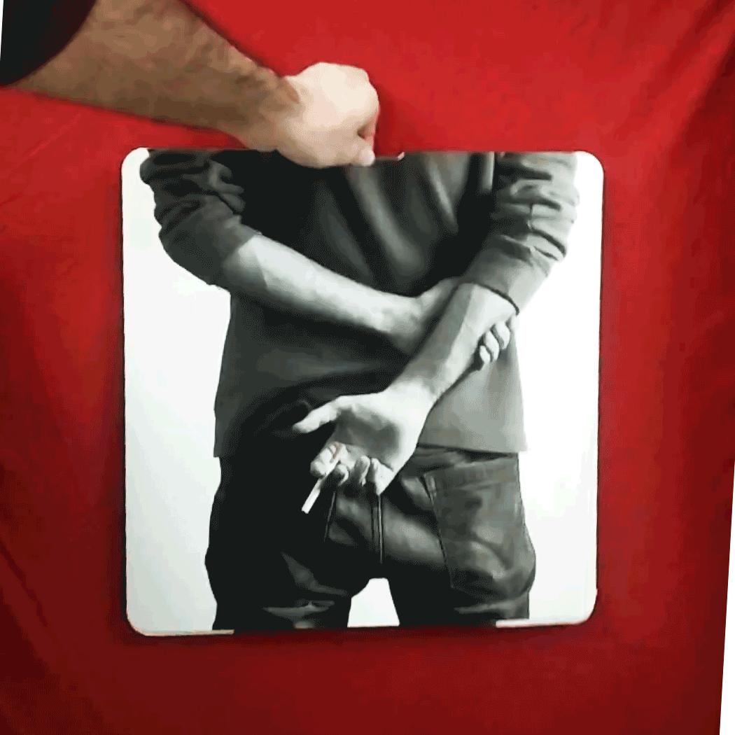
Full Card Sweep
Branding · Digital Marketing · UI · Front-End Dev
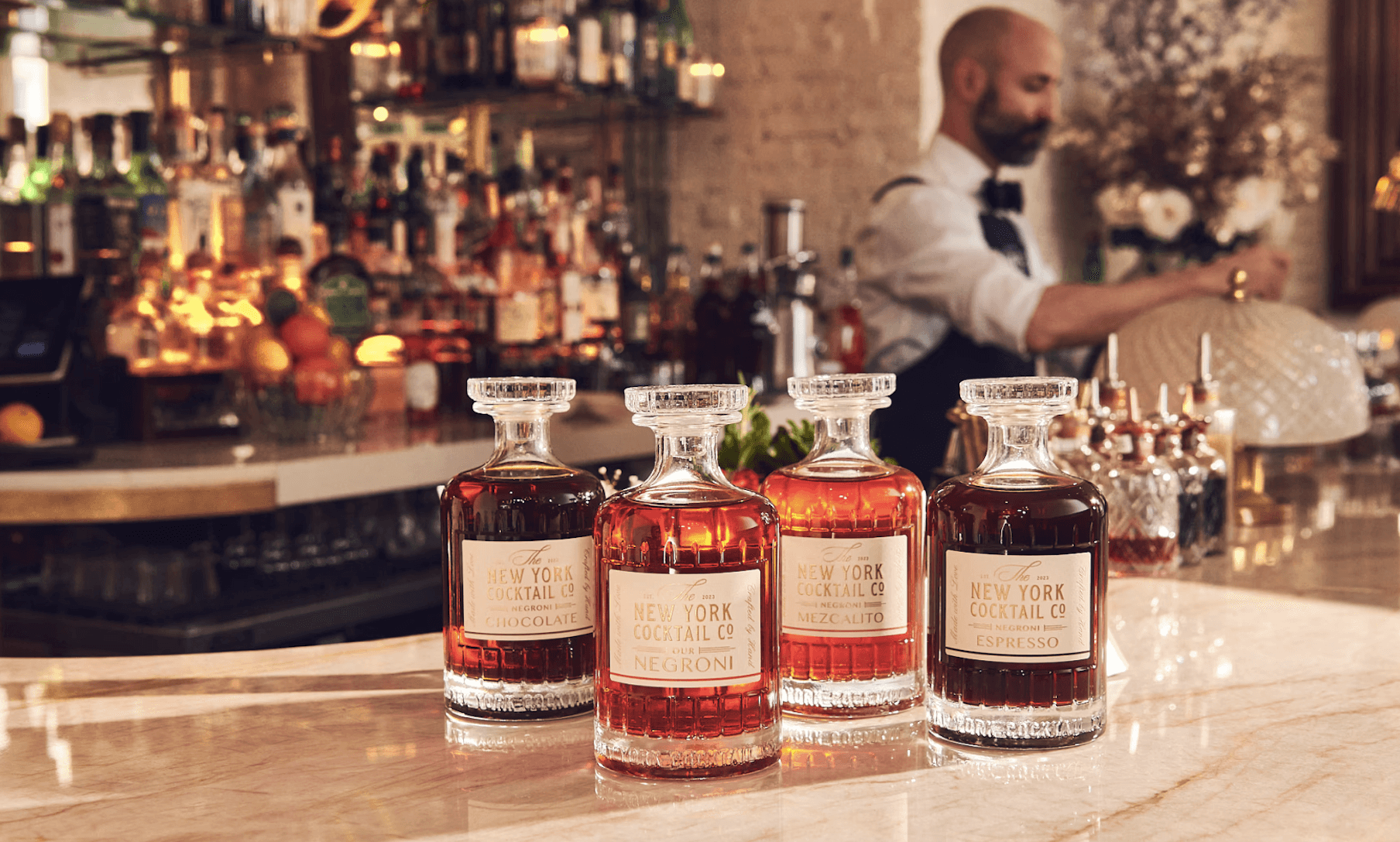
NY Cocktail Co.
Branding · Digital Marketing · UI · Front-End Dev


Phigora
Branding · Experiential · Digital Marketing · UI
Typomania
Branding · Motion

Spellbound Wines
Branding · Motion · Digital Marketing · Experiential
Explore More Projects
Johnny Johnny
Branding · Art Direction · Print · Packaging
Full Card Sweep
Branding · Digital Marketing · UI · Front-End Dev
NY Cocktail Co.
Branding · Digital Marketing · UI · Front-End Dev
Phigora
Branding · Experiential · Digital Marketing · UI
Typomania
Branding · Motion
Spellbound Wines
Branding · Motion · Digital Marketing · Experiential