The New USPS
The New USPS
UX · Branding · Experiential
Reimagining the Post Office
Reimagining the Post Office
Project Timeline
Project Timeline
01/2017 - 04/2017
My Role
My Role
Visual Designer
UX Designer
UX Researcher
Information Designer
Environmental Designer
Team
Team
Mentor & Professor:
Joseph DiGioia
Class:
Environmental/Spatial Design
Deliverables
Deliverables
Ideation
Brand Identity
UX Research + Design
Lo-fi Prototypes
Data Visualization
Infographics
Environmental Graphics
3D Spatial Design
A New Vision for USPS
The Post Office is universally disliked—long queues, impersonal service, and outdated processes make it a frustrating experience for many. Through research, spatial innovation, and user-centered design, this project aimed to redefine USPS as a meaningful, engaging public space.
As a finalist at SCAD Secession 2019, this project was recognized for its innovative approach to experiential design and earned Outstanding Experiential Design at the AIGA Jacksonville Portfolio Reviews.
🏆 Finalist – SCAD Secession 2019
⭐ Outstanding Experiential Design – AIGA Jacksonville Portfolio Reviews

Why the Post Office?
At its core, this project was about redefining ‘space’ vs. ‘place’. The Post Office stood out because it evoked strong negative emotions. Ethnographic research confirmed this:
6,537 complaints were lodged against USPS on online forums, with users citing:
“Rude and belligerent staff”
“Endless waiting times”
“A cold and inefficient system”
This raised a critical question: What could the ‘new’ Post Office offer beyond its traditional role?

The Problem: Designing for Trust & Efficiency
To reimagine the Post Office, I focused on key How Might We statements:
How might the design of the space build trust among its users?
How might we solve the problem of long queues?
How might we improve the staff-customer dynamic?
By addressing these pain points through environmental design and user experience principles, the goal was to create a faster, more transparent, and user-friendly USPS experience.


Visual Identity: A Metaphor for Movement
The new visual system drew inspiration from dashed lines—symbolizing envelopes traveling through time and space. This metaphor was integrated into:
Wayfinding graphics guiding users efficiently through the space.
Signage and branding to reinforce the magic of mail and logistics.
Motion design concepts that visualize mail movement in real-time.

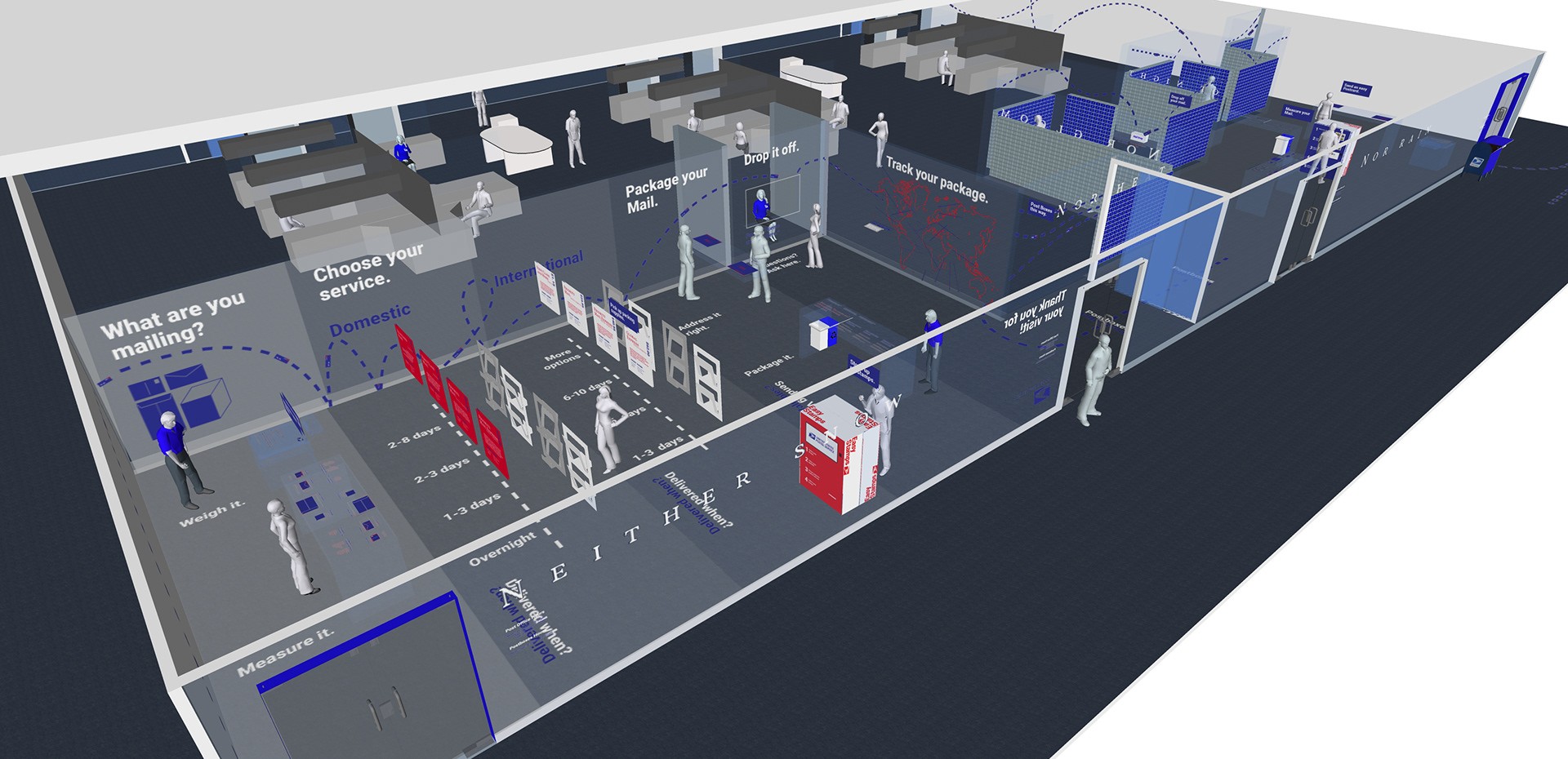
Spatial Innovation: Rethinking Customer Flow
The new USPS experience prioritized self-service and transparency to reduce wait times and improve user trust.

1. Removing Barriers
Inspired by airports and self-checkout lanes, the new design minimized staff counters in favor of a self-guided experience, where users navigate transactions independently.

2. Transparent Architecture for Trust
Ethnographic research revealed a lack of trust in federal institutions. The solution? Transparent walls—a symbol of openness and accountability, making USPS feel more approachable and public-friendly.

3. Dynamic Queue System
Instead of static waiting areas, users could pre-register, receive digital queue updates, and move through designated service zones, streamlining operations and eliminating long wait times.


Final Process Video: The Design Thinking Behind Reimagining USPS
This final process video captures the full journey of reimagining the USPS experience—from research to prototyping to final execution. Using a design thinking framework, the project followed an iterative, user-centered approach to transform one of the most frustrating public spaces into an intuitive and efficient experience.
What You’ll See in the Video:
🧐 Empathize – Deep user research, ethnographic studies, and firsthand USPS customer insights that shaped our understanding of key frustrations.
🎯 Define – Synthesizing research findings into How Might We statements to guide problem-solving efforts, focusing on efficiency, trust, and accessibility.
💡 Ideate – Brainstorming visual identity concepts, spatial interventions, and queue management solutions that could enhance both user experience and operational efficiency.
📐 Prototype & Test – Iterative prototyping of spatial layouts, wayfinding systems, and transparent architecture, incorporating real-world feedback to refine the final design.
🚀 Final Execution – The polished USPS redesign, featuring a self-guided user flow, trust-building transparency elements, and a dynamic, user-friendly experience.

Final Thoughts & Recognition
This project challenged the conventional and envisioned the Post Office as a place of efficiency, clarity, and trust. The self-service model, transparency-focused design, and dynamic wayfinding system redefined how federal spaces could engage with the public.
Through a combination of experiential design, UX strategy, and environmental graphics, this project became a finalist at SCAD Secession 2019 and received Outstanding Experiential Design at the AIGA Jacksonville Portfolio Reviews—a testament to the power of design-driven innovation in public spaces.

A New Vision for USPS
The Post Office is universally disliked—long queues, impersonal service, and outdated processes make it a frustrating experience for many. Through research, spatial innovation, and user-centered design, this project aimed to redefine USPS as a meaningful, engaging public space.
As a finalist at SCAD Secession 2019, this project was recognized for its innovative approach to experiential design and earned Outstanding Experiential Design at the AIGA Jacksonville Portfolio Reviews.
🏆 Finalist – SCAD Secession 2019
⭐ Outstanding Experiential Design – AIGA Jacksonville Portfolio Reviews
Why the Post Office?
At its core, this project was about redefining ‘space’ vs. ‘place’. The Post Office stood out because it evoked strong negative emotions. Ethnographic research confirmed this:
6,537 complaints were lodged against USPS on online forums, with users citing:
“Rude and belligerent staff”
“Endless waiting times”
“A cold and inefficient system”
This raised a critical question: What could the ‘new’ Post Office offer beyond its traditional role?
The Problem: Designing for Trust & Efficiency
To reimagine the Post Office, I focused on key How Might We statements:
How might the design of the space build trust among its users?
How might we solve the problem of long queues?
How might we improve the staff-customer dynamic?
By addressing these pain points through environmental design and user experience principles, the goal was to create a faster, more transparent, and user-friendly USPS experience.
Visual Identity: A Metaphor for Movement
The new visual system drew inspiration from dashed lines—symbolizing envelopes traveling through time and space. This metaphor was integrated into:
Wayfinding graphics guiding users efficiently through the space.
Signage and branding to reinforce the magic of mail and logistics.
Motion design concepts that visualize mail movement in real-time.
Spatial Innovation: Rethinking Customer Flow
The new USPS experience prioritized self-service and transparency to reduce wait times and improve user trust.
1. Removing Barriers
Inspired by airports and self-checkout lanes, the new design minimized staff counters in favor of a self-guided experience, where users navigate transactions independently.
2. Transparent Architecture for Trust
Ethnographic research revealed a lack of trust in federal institutions. The solution? Transparent walls—a symbol of openness and accountability, making USPS feel more approachable and public-friendly.
3. Dynamic Queue System
Instead of static waiting areas, users could pre-register, receive digital queue updates, and move through designated service zones, streamlining operations and eliminating long wait times.
Final Process Video: The Design Thinking Behind Reimagining USPS
This final process video captures the full journey of reimagining the USPS experience—from research to prototyping to final execution. Using a design thinking framework, the project followed an iterative, user-centered approach to transform one of the most frustrating public spaces into an intuitive and efficient experience.
What You’ll See in the Video:
🧐 Empathize – Deep user research, ethnographic studies, and firsthand USPS customer insights that shaped our understanding of key frustrations.
🎯 Define – Synthesizing research findings into How Might We statements to guide problem-solving efforts, focusing on efficiency, trust, and accessibility.
💡 Ideate – Brainstorming visual identity concepts, spatial interventions, and queue management solutions that could enhance both user experience and operational efficiency.
📐 Prototype & Test – Iterative prototyping of spatial layouts, wayfinding systems, and transparent architecture, incorporating real-world feedback to refine the final design.
🚀 Final Execution – The polished USPS redesign, featuring a self-guided user flow, trust-building transparency elements, and a dynamic, user-friendly experience.
Final Thoughts & Recognition
This project challenged the conventional and envisioned the Post Office as a place of efficiency, clarity, and trust. The self-service model, transparency-focused design, and dynamic wayfinding system redefined how federal spaces could engage with the public.
Through a combination of experiential design, UX strategy, and environmental graphics, this project became a finalist at SCAD Secession 2019 and received Outstanding Experiential Design at the AIGA Jacksonville Portfolio Reviews—a testament to the power of design-driven innovation in public spaces.

Explore More Projects

Johnny Johnny
Branding · Art Direction · Print · Packaging


Full Card Sweep
Branding · Digital Marketing · UI · Front-End Dev

NY Cocktail Co.
Branding · Digital Marketing · UI · Front-End Dev


Phigora
Branding · Experiential · Digital Marketing · UI

Typomania
Branding · Motion


Spellbound Wines
Branding · Motion · Digital Marketing · Experiential
Explore More Projects
Johnny Johnny
Branding · Art Direction · Print · Packaging
Full Card Sweep
Branding · Digital Marketing · UI · Front-End Dev
NY Cocktail Co.
Branding · Digital Marketing · UI · Front-End Dev
Phigora
Branding · Experiential · Digital Marketing · UI
Typomania
Branding · Motion
Spellbound Wines
Branding · Motion · Digital Marketing · Experiential